

Presenting Data – Graphs and Tables
Types of data.
There are different types of data that can be collected in an experiment. Typically, we try to design experiments that collect objective, quantitative data.
Objective data is fact-based, measurable, and observable. This means that if two people made the same measurement with the same tool, they would get the same answer. The measurement is determined by the object that is being measured. The length of a worm measured with a ruler is an objective measurement. The observation that a chemical reaction in a test tube changed color is an objective measurement. Both of these are observable facts.
Subjective data is based on opinions, points of view, or emotional judgment. Subjective data might give two different answers when collected by two different people. The measurement is determined by the subject who is doing the measuring. Surveying people about which of two chemicals smells worse is a subjective measurement. Grading the quality of a presentation is a subjective measurement. Rating your relative happiness on a scale of 1-5 is a subjective measurement. All of these depend on the person who is making the observation – someone else might make these measurements differently.
Quantitative measurements gather numerical data. For example, measuring a worm as being 5cm in length is a quantitative measurement.
Qualitative measurements describe a quality, rather than a numerical value. Saying that one worm is longer than another worm is a qualitative measurement.
After you have collected data in an experiment, you need to figure out the best way to present that data in a meaningful way. Depending on the type of data, and the story that you are trying to tell using that data, you may present your data in different ways.
Data Tables
The easiest way to organize data is by putting it into a data table. In most data tables, the independent variable (the variable that you are testing or changing on purpose) will be in the column to the left and the dependent variable(s) will be across the top of the table.
Be sure to:
- Label each row and column so that the table can be interpreted
- Include the units that are being used
- Add a descriptive caption for the table
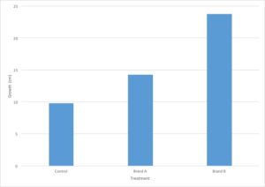
You are evaluating the effect of different types of fertilizers on plant growth. You plant 12 tomato plants and divide them into three groups, where each group contains four plants. To the first group, you do not add fertilizer and the plants are watered with plain water. The second and third groups are watered with two different brands of fertilizer. After three weeks, you measure the growth of each plant in centimeters and calculate the average growth for each type of fertilizer.
Scientific Method Review: Can you identify the key parts of the scientific method from this experiment?
- Independent variable – Type of treatment (brand of fertilizer)
- Dependent variable – plant growth in cm
- Control group(s) – Plants treated with no fertilizer
- Experimental group(s) – Plants treated with different brands of fertilizer
Graphing data
Graphs are used to display data because it is easier to see trends in the data when it is displayed visually compared to when it is displayed numerically in a table. Complicated data can often be displayed and interpreted more easily in a graph format than in a data table.
In a graph, the X-axis runs horizontally (side to side) and the Y-axis runs vertically (up and down). Typically, the independent variable will be shown on the X axis and the dependent variable will be shown on the Y axis (just like you learned in math class!).
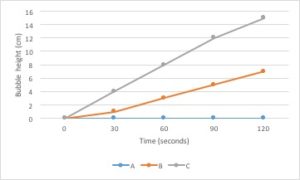
Line graphs are the best type of graph to use when you are displaying a change in something over a continuous range. For example, you could use a line graph to display a change in temperature over time. Time is a continuous variable because it can have any value between two given measurements. It is measured along a continuum. Between 1 minute and 2 minutes are an infinite number of values, such as 1.1 minute or 1.93456 minutes.
Changes in several different samples can be shown on the same graph by using lines that differ in color, symbol, etc.
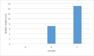
Bar graphs are used to compare measurements between different groups. Bar graphs should be used when your data is not continuous, but rather is divided into different categories. If you counted the number of birds of different species, each species of bird would be its own category. There is no value between “robin” and “eagle”, so this data is not continuous.
Scatter Plot
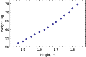
Scatter Plots are used to evaluate the relationship between two different continuous variables. These graphs compare changes in two different variables at once. For example, you could look at the relationship between height and weight. Both height and weight are continuous variables. You could not use a scatter plot to look at the relationship between number of children in a family and weight of each child because the number of children in a family is not a continuous variable: you can’t have 2.3 children in a family.
How to make a graph
- Identify your independent and dependent variables.
- Choose the correct type of graph by determining whether each variable is continuous or not.
- Determine the values that are going to go on the X and Y axis. If the values are continuous, they need to be evenly spaced based on the value.
- Label the X and Y axis, including units.
- Graph your data.
- Add a descriptive caption to your graph. Note that data tables are titled above the figure and graphs are captioned below the figure.
Let’s go back to the data from our fertilizer experiment and use it to make a graph. I’ve decided to graph only the average growth for the four plants because that is the most important piece of data. Including every single data point would make the graph very confusing.
- The independent variable is type of treatment and the dependent variable is plant growth (in cm).
- Type of treatment is not a continuous variable. There is no midpoint value between fertilizer brands (Brand A 1/2 doesn’t make sense). Plant growth is a continuous variable. It makes sense to sub-divide centimeters into smaller values. Since the independent variable is categorical and the dependent variable is continuous, this graph should be a bar graph.
- Plant growth (the dependent variable) should go on the Y axis and type of treatment (the independent variable) should go on the X axis.
- Notice that the values on the Y axis are continuous and evenly spaced. Each line represents an increase of 5cm.
- Notice that both the X and the Y axis have labels that include units (when required).
- Notice that the graph has a descriptive caption that allows the figure to stand alone without additional information given from the procedure: you know that this graph shows the average of the measurements taken from four tomato plants.
Descriptive captions
All figures that present data should stand alone – this means that you should be able to interpret the information contained in the figure without referring to anything else (such as the methods section of the paper). This means that all figures should have a descriptive caption that gives information about the independent and dependent variable. Another way to state this is that the caption should describe what you are testing and what you are measuring. A good starting point to developing a caption is “the effect of [the independent variable] on the [dependent variable].”
Here are some examples of good caption for figures:
- The effect of exercise on heart rate
- Growth rates of E. coli at different temperatures
- The relationship between heat shock time and transformation efficiency
Here are a few less effective captions:
- Heart rate and exercise
- Graph of E. coli temperature growth
- Table for experiment 1
Principles of Biology Copyright © 2017 by Lisa Bartee, Walter Shriner, and Catherine Creech is licensed under a Creative Commons Attribution 4.0 International License , except where otherwise noted.
Share This Book
Module 1: Data Analysis and Presentation
Data analysis and presentation.
Today’s lab exercises are designed to help you learn to collect and graph biological data in a scientific manner. The techniques you will practice today can be applied to many different types of data sets (e.g., wildlife populations or vegetation sampling). For convenience, we will use measurements that can be made in the classroom.
Part 1: Normal Distribution
Many characteristics, such as height or weight, are normally distributed in populations. In other words, there is an average for the population and roughly equal variance on both sides in the following pattern:

This is a classic “bell shaped” curve representative of a normal distribution. Note that it is symmetrical around an average value, and that most individuals are at or near the average. As the value gets more extreme (for example, taller or shorter height), there are fewer individuals represented.

- Height (in inches) without shoes—round to the nearest inch
- Weight (in pounds)—round to the nearest pound
- Hair length (in centimeters) from the scalp to the end of the longest hair
- Palpate the brachial artery
- Position cuff above the brachial artery and locate the pulse in the brachial artery using the stethoscope.
- Pump up cuff (increasing pressure on the brachial artery) while listening to brachial artery. When the pulse disappears, the cuff’s pressure is GREATER than the pressure of the blood pushing out! Continue pumping for about 20 mmHg beyond this point.
- Slowly release pressure to allow blood back through the vessel.
- Karotkoff (kŏ-rot′kof) sounds begin, marking systolic pressure.
- Turbulent blood pushes through the brachial artery.
- Eventually as the pressure releases, the turbulence ceases.
- When the turbulence is gone, record diastolic pressure.
- Mean Arteral Pressure (MAP) = Diastolic Pressure + 1/3 Pulse Pressure Pulse Pressure = Systolic Pressure – Diastolic Pressure
- Remember to record your own data!
Example MAP
Let’s use the example blood pressure of 120/80 (systolic/diastolic):
120 – 80 = 40 Pulse Pressure
MAP = 80 + (40/3) = 93.3 MAP
Remember, you round to the nearest whole number!
Place your data in a table similar to the one below (be sure to add as many rows as there are students).
Data Analysis
- Divide the range of heights into 3-inch increments; label the x-axis of the graph with these increments, increasing from left to right. There should be no overlap or gaps between increments
- The y-axis should represent the number of students that fall into each height increment. The range should be 0 at the bottom to 10 at top.

Part 2: Correlations
Sometimes two or more characteristics in a population may be correlated (or co-related). This means that they change together in a predictable way. For example, shoe size and height are likely to be correlated since the taller a person is the larger his/her feet are likely to be.
In biological data, as well as data from other fields such as sociology, correlation is often mistakenly taken to mean that there is a causal relationship. A causal relationship implies that one factor causes the other. For example, big feet and tallness are correlated, but big feet do not cause tallness or vice versa. Many correlative relationships reflect an underlying factor that affects both relationships. Another example would be the correlation between lung cancer incidence and lower income level workers.
Think about It
Does low income cause cancer? What might the underlying cause be?
A correlation may be positive or negative. In a positive correlation, an increase in one value is followed by an increase in another value. In a negative correlation, an increase in one value is followed by a decrease in another value. To determine if there is a correlation between two sets of data it is common to graph the two factors against each other, with both values increasing from the point of origin. All data points are plotted and a “best of fit” line is drawn. Check out these two examples:

Download this graph paper template to complete this section.
- Using the class data collected, construct a graph of height (x-axis) vs. weight (y-axis). Be sure to use a scale that will give you a reasonably large graph; don’t end up with all your data points crowded in one place!
- Each student in the class will be represented by a single dot. Once all the dots are drawn, draw a straight or curved “best of fit” line through the dots.
- Using the class data, construct a graph of height (x-axis) vs. hair length (y-axis).
- After all the points are plotted, draw a “best of fit” line or curve.
- Using the class data, construct a graph of height (x-axis) vs. MAP (y-axis).
- After all the points are plotted draw a “best of fit” line.
Lab Questions
- Did you see any resemblance to a “bell-shaped” curve in your height distribution graphs? Why or why not?
- Were the height distributions of males and females in your class different? Explain your answer.
- Was there a correlation between height and weight? Was it positive or negative?
- Was there a correlation between height and hair length?
- Was there a correlation between height and MAP? What might be a better factor(s) that would correlate with blood pressure?
- A wildlife biologist finds that there is a positive correlation between the number of deer and the number of rabbits in 20 different study areas. This biologist concludes that the deer and the rabbits are somehow helping each other survive. Do you see any problems with this logic? What possible explanations would you offer for this phenomenon?
- Biology Labs. Authored by : Wendy Riggs. Provided by : College of the Redwoods. Located at : http://www.redwoods.edu . License : CC BY: Attribution
- Modification of Gray 527. Authored by : Henry Gray. Located at : https://commons.wikimedia.org/wiki/File:Gray527.png . Project : Anatomy of the Human Body. License : Public Domain: No Known Copyright
- Top Courses
- Online Degrees
- Find your New Career
- Join for Free

Data Visualization for Genome Biology
Taught in English
Financial aid available
Gain insight into a topic and learn the fundamentals

Instructor: Nicholas James Provart
Included with Coursera Plus
Recommended experience
Intermediate level
Some familiarity with basic molecular biology, e.g. https://learn.saylor.org/course/BIO101.
Details to know

Add to your LinkedIn profile
See how employees at top companies are mastering in-demand skills

Earn a career certificate
Add this credential to your LinkedIn profile, resume, or CV
Share it on social media and in your performance review

There are 6 modules in this course
The past decade has seen a vast increase in the amount of data available to biologists, driven by the dramatic decrease in cost and concomitant rise in throughput of various next-generation sequencing technologies, such that a project unimaginable 10 years ago was recently proposed, the Earth BioGenomes Project, which aims to sequence the genomes of all eukaryotic species on the planet within the next 10 years. So while data are no longer limiting, accessing and interpreting those data has become a bottleneck. One important aspect of interpreting data is data visualization. This course introduces theoretical topics in data visualization through mini-lectures, and applied aspects in the form of hands-on labs. The labs use both web-based tools and R, so students at all computer skill levels can benefit. Syllabus may be viewed at https://tinyurl.com/DataViz4GenomeBio.
In this module we'll cover 3 straightforward approaches for generating simple plots. As we'll see in the lab, often visualizing datasets can help us see the overall shape of the data that might not be captured in descriptive statistics like mean and standard deviation. Plotting datasets is also a useful way to identify outliers. In the mini-lectures we go over some common biological data visualization paradigms and more generally what the common chart types are, and we also talk about the context and grammar of data visualization.
What's included
5 videos 5 readings 2 quizzes 1 ungraded lab
5 videos • Total 32 minutes
- Course Introduction and Common Biological Data Visualization Paradigms • 9 minutes • Preview module
- Types of Charts • 6 minutes
- Data Visualization Literacy • 5 minutes
- Importance of Context • 3 minutes
- Lab 1 Discussion • 6 minutes
5 readings • Total 94 minutes
- Introduction and Common Biological Data Visualization Paradigms • 1 minute
- Types of Charts • 1 minute
- Data Visualization Literacy • 1 minute
- Importance of Context • 1 minute
- Lab 1 Manual • 90 minutes
2 quizzes • Total 17 minutes
- Lectures Quiz 1 • 10 minutes
- Lab 1 Quiz • 7 minutes
1 ungraded lab • Total 15 minutes
- Lab 1 R • 15 minutes
In this week's module we explore ways of displaying biological variation and a little bit of background about track viewers. We also cover visual perception, Gestalt principles, and issues related to colour perception, important for accessibility-related reasons. In the lab we'll use an online app, PlotsOfDifferences, to generate some charts that display variation nicely, and we'll also use R to generate some box plots, histograms, and violin plots. Last but not least, we'll try adjusting some of the settings in JBrowse to help assess gene expression levels in a more intuitive manner. Thanks to Dr. Joachim Goedhart, University of Amsterdam, Netherlands for permission to use PlotsOfDifferences in the lab.
4 videos 4 readings 2 quizzes 1 ungraded lab
4 videos • Total 29 minutes
- Introduction - Variation in Biology and Track Viewers • 9 minutes • Preview module
- Visual Perception • 8 minutes
- Accessibility • 4 minutes
- Lab 2 Discussion • 7 minutes
4 readings • Total 93 minutes
- Introduction - Variation in Biology and Track Viewers • 1 minute
- Visual Perception • 1 minute
- Accessibility • 1 minute
- Lab 2 Manual • 90 minutes
- Lectures Quiz 2 • 10 minutes
- Lab 2 Quiz • 7 minutes
- Lab 2 R • 15 minutes
In this week's module we explore ways of visualizing gene expression data after briefly covering how we can measure gene expression levels with RNA-seq and identify significantly differentially expressed genes using statistical tests. We also cover design thinking. In the lab we'll use an online platform, Galaxy, to generate a volcano plot for visualizing significantly differentially expressed genes, and we'll also use R to generate some heatmaps of gene expression. Last but not least, we'll create our own "electronic fluorescent pictographs" for a gene expression data set.
3 videos 3 readings 2 quizzes 1 ungraded lab
3 videos • Total 36 minutes
- Introduction - Gene Expression Data • 15 minutes • Preview module
- Design Thinking for Data Visualization • 9 minutes
- Lab 3 Discussion • 11 minutes
3 readings • Total 92 minutes
- Introduction - Gene Expression Data • 1 minute
- Design Thinking for Data Visualization • 1 minute
- Lab 3 Manual • 90 minutes
- Lectures Quiz 3 • 10 minutes
- Lab 3 Quiz • 7 minutes
- Lab 3 R • 15 minutes
In this week's module we cover how the Gene Ontology can be used to make sense of often overwhelmingly long lists of genes from transcriptomic and other kind of 'omic experiments, especially through Gene Ontology enrichment analyses. We'll also look at Agile Development and User Testing and how these can help improve data visualization tools. In the lab, we'll try our hand at 3 online Gene Ontology analysis apps, and create some nice overview charts for GO enrichment results in R. Thanks to Dr. Roy Navon, Technion University, Israel, for permission to use GOrilla in the lab. Thanks to Dr. Juri Reimand of the University of Toronto for permission to use g:Profiler. And thanks to Dr. Zhen Su of the China Agricultural University for permission to use AgriGO.
3 videos • Total 31 minutes
- Introduction - Gene Ontology • 12 minutes • Preview module
- Agile Development and User Testing • 10 minutes
- Lab 4 Discussion • 8 minutes
- Introduction - Gene Ontology • 1 minute
- Agile Development and User Testing • 1 minute
- Lab 4 Manual • 90 minutes
- Lectures Quiz 4 • 10 minutes
- Lab 4 Quiz • 7 minutes
- Lab 4 R • 15 minutes
In this week's module, we explore tools for displaying and analyzing graph networks, notably those created when we generate protein-protein interactions, especially in a high-throughput manner. These PPIs are deposited in online databases like BioGRID, and can be retrieved on-the-fly via web services for display in powerful network visualization apps like Cytoscape. We'll talk about other web services/APIs that are available for biology in one of the mini-lectures, and in the lab we'll use Cytoscape to explore interactors of BRCA2. We'll also use a plug-in called BiNGO to do Gene Ontology enrichment analyses of its interactors, continuing our exploration of GO that we started last week. Last, we'll try using D3 to display an interaction network in a web page.
3 videos 3 readings 2 quizzes
3 videos • Total 28 minutes
- Introduction - Biological Networks • 10 minutes • Preview module
- Web Programming and Data Visualization • 9 minutes
- Lab 5 Discussion • 9 minutes
- Introduction - Biological Networks • 1 minute
- Web Programming and Data Visualization • 1 minute
- Lab 5 Manual • 90 minutes
- Lectures Quiz 5 • 10 minutes
- Lab 5 Quiz • 7 minutes
In this module we cover methods for generating and making sense of ever bigger biological data sets. The growth in sequencing capacity has enabled projects that we unimaginable even a few years ago, such as the Earth Biogenomes Project, which aims to sequence the genome of a representative of every eukaryotic species on the planet. In order to make sense of these large data sets, it is often useful to use dimentionality reduction methods, like t-SNE, PCA, and UMAP, to help visualize how similar samples are. Logic diagrams (Venn-Euler or Upset plots) are also useful for displaying how sets of genes are similar one to another. Thanks to Dr. Tim Hulsen (Philips Research, the Netherlands) for permission to use the DeepVenn app in the lab.
3 videos • Total 29 minutes
- Intro - Ever Bigger Biological Data • 12 minutes • Preview module
- Dimensionality Reduction and Logic Diagrams • 11 minutes
- Lab 6 Discussion • 6 minutes
- Introduction - Ever Bigger Biological Data • 1 minute
- Dimensionality Reduction and Logic Diagrams • 1 minute
- Lab 6 Manual • 90 minutes
- Lectures Quiz 6 • 10 minutes
- Lab 6 Quiz • 7 minutes
- Lab 6 R • 15 minutes

Established in 1827, the University of Toronto is one of the world’s leading universities, renowned for its excellence in teaching, research, innovation and entrepreneurship, as well as its impact on economic prosperity and social well-being around the globe.
Recommended if you're interested in Data Analysis

University of Toronto
Bioinformatic Methods II
Coursera Project Network
A Geometrical Approach to Genome Analysis: Skew & Z-Curve
Guided Project

Imperial College London
Building on the SIR Model

Stanford University
RNA Biology with Eterna
Why people choose coursera for their career.

New to Data Analysis? Start here.

Open new doors with Coursera Plus
Unlimited access to 7,000+ world-class courses, hands-on projects, and job-ready certificate programs - all included in your subscription
Advance your career with an online degree
Earn a degree from world-class universities - 100% online
Join over 3,400 global companies that choose Coursera for Business
Upskill your employees to excel in the digital economy
Frequently asked questions
When will i have access to the lectures and assignments.
Access to lectures and assignments depends on your type of enrollment. If you take a course in audit mode, you will be able to see most course materials for free. To access graded assignments and to earn a Certificate, you will need to purchase the Certificate experience, during or after your audit. If you don't see the audit option:
The course may not offer an audit option. You can try a Free Trial instead, or apply for Financial Aid.
The course may offer 'Full Course, No Certificate' instead. This option lets you see all course materials, submit required assessments, and get a final grade. This also means that you will not be able to purchase a Certificate experience.
What will I get if I purchase the Certificate?
When you purchase a Certificate you get access to all course materials, including graded assignments. Upon completing the course, your electronic Certificate will be added to your Accomplishments page - from there, you can print your Certificate or add it to your LinkedIn profile. If you only want to read and view the course content, you can audit the course for free.
What is the refund policy?
You will be eligible for a full refund until two weeks after your payment date, or (for courses that have just launched) until two weeks after the first session of the course begins, whichever is later. You cannot receive a refund once you’ve earned a Course Certificate, even if you complete the course within the two-week refund period. See our full refund policy Opens in a new tab .
Is financial aid available?
Yes. In select learning programs, you can apply for financial aid or a scholarship if you can’t afford the enrollment fee. If fin aid or scholarship is available for your learning program selection, you’ll find a link to apply on the description page.
More questions
Thank you for visiting nature.com. You are using a browser version with limited support for CSS. To obtain the best experience, we recommend you use a more up to date browser (or turn off compatibility mode in Internet Explorer). In the meantime, to ensure continued support, we are displaying the site without styles and JavaScript.
- View all journals
- Explore content
- About the journal
- Publish with us
- Sign up for alerts
- Published: 23 January 2019
Good data, bad data and ugly data
Nature Microbiology volume 4 , page 209 ( 2019 ) Cite this article
4262 Accesses
3 Altmetric
Metrics details
- Microbiology
- Research data
Researchers can be expected to employ a vast range of experimental techniques in pursuit of a scientific question. Making efforts to seek expert advice and develop the competency to generate, store and analyse high-quality data when first using an approach will save time in the long run.
Where previously it was possible to build a career mainly focusing on a relative few of the many experimental disciplines that might conceivably be employed in our field, today’s microbiologists may find themselves having to generate and handle a far wider range of data types — from molecular biology, biochemistry and cell biology, through animal husbandry and surgery, to computer programming, bioinformatics, structure determination and statistics, with a multitude of others beside. While this certainly leads to a broad general experimental understanding, it risks a generation of researchers that are Jack or Jill of all trades, yet master of none. It is also not unheard of that the principal investigator(s) leading a project do not themselves have deep experience in a particular data type important for the project, which together can limit the quality of oversight that they can provide for any single project researcher. Furthermore, research projects are commonly carried out in time-limited situations, with deadlines imposed by the need to publish before a position ends, to find a next post, to apply for fellowships and funding. A lack of experience to draw upon when designing and undertaking a series of experiments, as well as the underlying time pressure, can lead researchers to cut corners, whether knowingly or not. If we are not careful, practices can creep in that lower the quality, usability and reliability of data and the analysis built thereupon.
Even for standard techniques, problems can begin at the experimental design phase when considering what technical or biological repetitions are feasible, which positive and negative controls can or should be included, how the samples should be processed, and the data generated, analysed and stored. Without in-depth experience in a particular approach, it is easy to make a misstep that undermines an entire experiment. In addition, the technology used to generate, process and analyse both visual and non-visual data types changes with time, providing increased ease of use, finer resolution or greater volumes of data to be incorporated, but also poses new risks, since the opportunity to tweak various parameters opens new potential biases in how we view and interrogate data. With visual data in particular, image capture and analysis programmes have a range of options that make it easier to modify data presented, to change dimensions and alter contrast, to stitch together or merge multiple images, or to remove elements entirely. While such programme features are introduced for good reasons, they also create opportunity for beautification or worse still, manipulation of data with the intent to deceive.
Let us take Western blotting as an example. For many microbiologists, Western blotting will be a core skill used frequently in their day-to-day research, but for others will be something done only a few times in a year. Where traditionally the signal on a Western blot would have been detected using photographic film, often with multiple exposures of differing length, it has become increasingly commonplace to use charged-coupled device (CCD) camera technology to detect fluorescent signal from a blot. CCD cameras can have many advantages for developing Western blots in terms of ease of use, greater sensitivity and dynamic range, reduced background noise, generating digital data. However, the programmes they use also allow for various parameters to be altered that affect the way the blot appears, often before the data is even saved. This allows specific lanes, or groups of bands, to be selected and modified to enhance particular features of the data or decrease background signal and then saved as original data, without the context provided by the entire blot. In addition to changes in the way that blots are developed, long-established best practices such as inclusion of molecular weight markers, staining blots to check equal loading of each lane or consistent transfer from gel to membrane, and using suitable positive and negative controls, are increasingly falling by the wayside. The result is that for a significant number of the papers submitted to Nature Microbiology , Western blot data is of questionable quality and it can be challenging to distinguish cases where manipulation has taken place from untainted data that has simply not been generated and stored appropriately.
Like many other journals, in addition to asking authors to complete a reporting checklist to ensure that key experimental approaches are adequately described, for Western data we require authors to provide original raw data for all blots and gels in articles to be accepted. We then editorially assess whether the data included in figures correlates with the source data and undertake integrity checks to look for signs of manipulation. We do not expect all blots to be immaculately presented; blots can be ‘ugly’ and still be good data. However, we strongly recommend that the raw data initially generated includes the entire blot (not just selected lanes), with molecular weight markers clearly labelled and suitable loading controls provided. Removal of certain lanes from a blot is acceptable if they are not pertinent to the scientific point being supported, but any splices should be clearly delineated in the figure and the relevant lanes noted on the raw data. Given the mobile nature of the research workforce, groups should also establish standard procedures for how their data is stored and catalogued, so that raw data for any given figure can be accessed and re-analysed at a future point, even after the individual that generated the data has moved on. In cases where we cannot be confident that the data is real, unmodified and matches the source data, or where the source data cannot be found, we will not proceed with publication.
Of course by the time we get a chance to see any data, if any corners have been cut it will have happened many months, if not years, previously. If a microbiologist is about to undertake an experiment for which they are not previously experienced, whether technically demanding or more straight-forward, we recommend seeking advice and input from researchers experienced in the technique (lab mates, collaborators, institutional colleagues or others in the field) at the experimental design stage to establish best practice. Proceeding with less haste in these early stages can actually end up saving time in the long run if it means that the data output of an experiment is well-controlled, appropriately described and informative.
Rights and permissions
Reprints and permissions
About this article
Cite this article.
Good data, bad data and ugly data. Nat Microbiol 4 , 209 (2019). https://doi.org/10.1038/s41564-019-0365-1
Download citation
Published : 23 January 2019
Issue Date : February 2019
DOI : https://doi.org/10.1038/s41564-019-0365-1
Share this article
Anyone you share the following link with will be able to read this content:
Sorry, a shareable link is not currently available for this article.
Provided by the Springer Nature SharedIt content-sharing initiative
Quick links
- Explore articles by subject
- Guide to authors
- Editorial policies
Sign up for the Nature Briefing: Microbiology newsletter — what matters in microbiology research, free to your inbox weekly.

Collecting and presenting data
These guidelines do not presuppose that a perfect experiment or an ironclad conclusion exists. In fact, variation between studies and experiments is an important source of new discoveries. For this reason it is important to report data and experimental conditions as fully and transparently as possible both to verify findings and also to help future researchers identify sources of variation and anomalies.
Depending on the research question being asked or experimental system being used, some of the following “best practices” may not be feasible or appropriate for your study. In that case, exercise the “best practice” of explaining and justifying any deviation from the norm.
Descriptions of biological materials
Papers should describe biological materials with enough information to uniquely identify materials, including catalog numbers and repository accession numbers, when available. Consider using Research Resource Identifiers (RRIDs) , unique machine-readable and searchable identifiers, to report which reagents and tools were used. Make sure to keep track of the following information as you perform experiments.
Define species of origin and source of all antibodies used, including catalog/lot numbers.
Describe how novel antibodies were generated, including preparation and purification of epitope/antigen.
Describe data supporting antibody specificity, including post-translational modifications or neoepitopes.
If possible, demonstrate loss of immunoreactivity following genetic or other molecular modification to the antigen.
Cell lines should be checked against the ICLAC commonly misidentified or contaminated cell lines database .
Specify method used to authenticate cell lines.
Animals. Specify animal source, species, strain, sex, age, and relevant details of husbandry. For transgenic animals, specify the genetic background.
Quantitative data and statistics
Quantitative data must be reported transparently to ensure reproducibility and enable discovery. Find more information about the rationale for these recommendations in the Editorial: Transparency is the Key to Quality.
Clearly define replicates . How many technical and biological replicates were performed during how many independent experiments? How is the replication represented by the data points shown in figures? Report this information in the methods section and include relevant details in figure legends.
If you choose to show representative data from several independent experiments or assays, indicate where the remaining data can be found.
If a well-established and supported community database where you can upload your data does not already exist, ensure the long-term availability of your data by depositing it in a database such as Zenodo, Dryad, or Figshare and report the corresponding doi.
Excluded data. State whether any data were excluded from the quantitative analyses. If so, indicate the reason and criteria for exclusion.
Bar graphs. Simple bar graphs to report mean±SEM values are not generally permitted: authors should super-impose a scatter plot to report the reproducibility of independent biological replicates within such data sets, and report mean±S.D. values to make the distribution and variation transparent.
Line graphs: Data points on all line graphs should be shown as the mean±S.D.
Randomization. Indicate whether and how samples were randomized during analysis and processing.
Testing for statistically significant differences. Tests used to determine whether differences between data sets are statistically significant should be precisely and fully described. The exact p-values should be reported. Comparisons of more than 2 data sets from the same experiment should be done with an appropriate 1- or 2-way ANOVA with specifically defined post hoc tests. The results of all statistical comparisons between experimental groups should be fully reported in each figure legend (or in a separate supplementary table), including exact p values where appropriate.
Additional resources and guides on statistical analyses may be found on the Graphpad website (please note that the JBC does not specifically endorse the use of this software).
Figure preparation begins when you collect your image data, so it is worth your time to get this right from the outset. Questions regarding image validity can lead to delays in publication, corrections to published articles, or retractions of articles.
Read JBC's Due Diligence columns for detailed advice and commentary on figure preparation.
General considerations
No specific feature within an image may be enhanced, obscured, moved, removed, or introduced. Blemishes, stray marks, and so forth are a hallmark of true data.
Adjustments of brightness, contrast, or color balance are acceptable if they are applied to every pixel in the image and as long as they do not obscure, eliminate, or misrepresent any information present in the original, including the background. Nonlinear adjustments (e.g., changes to gamma settings) must be disclosed in the figure legend.
Images should not be under- or over- exposed and should be saved at an appropriate resolution .
Do not prepare images in PowerPoint or save them in JPEG format .
If scanning images with a flat-bed scanner, scan with a minimum resolution of 300 dpi with no adjustments.
Microscopy data should be collected and presented with a magnification necessary to clearly illustrate the findings and include scale bars.
Make and model of microscope
Type, magnification, and numerical aperture of the objective
Temperature
Imaging medium
Fluorochromes
Camera make and model
Acquisition software
Any software used for image processing subsequent to data acquisition. Please include details and types of operations involved (e.g., type of deconvolution, 3D reconstitutions, surface or volume rendering, gamma adjustments, etc.)
If you export files from a microscope or other acquisition device, be sure to use consistent file formats (8 bit, 16 bit, etc.).
Images that are a composite of separate images should have the borders of original images clearly marked.
Co-localization of two or more signals from different fluorophores or stains should be supported by merged images from the channels at a resolution sufficient to distinguish the features of interest.
Fluorescence images should show signals from individual channels in gray scale to reveal the full dynamic range of intensities, and to allow color-blind individuals to appreciate your data. Merged images should be presented in color, with distinct colors for individual channels.
- Kuwana T et al., J Biol Chem. 295, 1623-1636.
Quantitative statements regarding the cellular distribution of molecules or changes in their levels should be supported by quantification of corresponding regions.
When quantifying, make sure the exposure used leads to a signal that is within the linear range afforded by that method.
In the case of fluorescence images using primary antibody and secondary antibody combinations, controls such as a non-immune antibody, omission of the primary antibody, and absence of antigen may be necessary to demonstrate specificity.
Criteria for image selection and analysis should be clearly explained, and data should include numbers of replicates and appropriate statistical analyses to determine significance.
Blot images and quantification
Gels provide a perfect blank canvas to test a variety of scientific questions, but the meaning behind those bands is lost without proper context. Follow the guidelines below to make sure your results are clear and convincing.
The source of all antibodies should be provided, with catalog, lot and RRID numbers where appropriate. The steps taken to validate the specificity of the antibody should be described.
Blots should show full tonal range. A loss of tonal range is a loss of data.
Crop immunoblots in a way that retains information about antigen size and antibody specificity.
Include positions of molecular weight markers above and below the band(s) of interest. (Example below.)
Avoid assembling figures of blots by splicing lanes from different sections of a gel. If blots must be spliced, borders must be clearly marked and explained in the figure legend (see example below). Splicing between different blots or gels is not allowed.
If blots are quantitatively analyzed, record how data were obtained, whether signal intensity was linear with antigen loading, and how protein loading was normalized. Some detection methods (e.g., ECL) have a very limited linear range.
Normalize signal intensity to total protein loading (assessed by staining membranes for total protein) whenever possible. “House-keeping” proteins should not be used for normalization without evidence that the experimental manipulations do not affect expression.
Antibodies that recognize post-translationally modified proteins should be normalized to total levels of the target protein.
Structures and models
Data for new NMR spectroscopy, X-ray crystallographic or cryo-electron microscopy structures should always be deposited in the Protein Data Bank (NMR and X-ray) or EM Data Bank (electron microscopy).
For JBC papers, coordinates for newly determined structures must be submitted to the respective repositories and made publicly available at acceptance, because publication will occur within 24 hours of manuscript acceptance. No data are to be withdrawn from the Protein Data Bank or the BMRB once a paper has been accepted and published as a Paper in Press article.
Papers describing the activity of synthetic or natural chemical entities must include the chemical structures of such molecules as systematic names, drawn structures, or both.
For synthesized chemicals, a synthetic protocol should be provided, generally as part of the supporting information. Alternatively, reference to a publication or issued patent that includes full synthetic details can be provided.
For isolated chemicals, methods for extraction/purification of the chemical and determination of its structure should be provided in the methods section.
Enzyme activity data
Papers reporting kinetic and thermodynamic data should include the identity of the biomolecule(s), relevant biological information (e.g., species and tissue normally found in, any post-translational modifications), preparation and criteria of purity, assay conditions, methodology, activity, and all other information relevant to judging the reproducibility of the results. The guidelines from the Beilstein Institut/STRENDA Commission have more details and suggestions to keep in mind as you are performing experiments and preparing your manuscript.
Enzyme activity (steady-state) generally should be reported in terms of k cat ( V max divided by molar enzyme concentration); V max per time is also acceptable. K m units are given in molarity.
Any other units of activity (absorbance, % change) should be converted to units of molarity to express k cat or V max . Values of k cat ( V max ) and K m should be estimated using nonlinear fitting (and the software system cited).
Parameters should include estimates of error (SD preferred). The use of linear transformations for calculation of Michaelis-Menten parameters is recognized to be inaccurate. The use of any linear transformations should be justified (e.g., graphical presentation of inhibition).
A lack of activity should be defined in terms of a limit of detection. In a series of comparisons to a basal or control level of activity (e.g., set as unity or 100%), this activity should be indicated, in the units mentioned above, along with estimates of error. The inclusion of examples of some of the raw data is encouraged.
K i values are preferred to IC 50 .
Datasets can be submitted to the STRENDA database , which is an electronic validation and storage system for functional enzyme data and provides a search repository for standardized enzyme kinetics data, which can benefit a larger research community. If an author chooses to submit kinetic data to STRENDA DB, the data become publicly available only after the corresponding article has been published. Additionally, authors can report new functional results to UniProtKB , a resource of protein sequence and functional information, so the description of their protein of interest is up to date.
-Omics datasets
Authors of papers that include -omics data should comply with ASBMB guidelines .
Animal studies
Report animal source, strain, sex, age, and details of husbandry.
State whether studies were blinded or not. If so, indicate the method and extent of blinding.
Ensure that all research has been reviewed and approved by an Institutional Animal Care and Use Committee and include a statement to this effect in the experimental procedures section of the manuscript. Consult the ARRIVE guidelines for reporting animal research.
Human studies
All studies involving human subjects must be approved by the appropriate review board(s) and abide by the Declaration of Helsinki principles; include a specific statement declaring approval and Helsinki compliance in the experimental procedures section. Do not provide any identifying information (e.g., names, true initials, recognizable images) unless the information is essential for scientific purposes and the patient (or patient’s parent/guardian) gives written informed consent for publication. If the patient is deceased, then the authors should seek consent from a relative. Many journals will ask you to demonstrate you have received this consent by completing and uploading a consent form as part of your manuscript files.
Gene expression and genetic manipulation
Include appropriate controls for CRISPR/Cas experiments, such as results from two or more guides and two or more independent clones. Experiments in cells, including induced pluripotent stem cells, should include an isogenic control with cells that retain a wild-type allele.
Verify CRISPR/Cas-mediated insertion/deletions by sequencing and show loss of the protein by immunoblotting, if antibodies are available. When antibodies are not available, changes in RNA expression should be validated by quantitative RT-PCR.
RNA interference (RNAi) experiments should include at least two different siRNAs that are complementary to different portions of the target gene and control siRNAs with sequences altered from the target.
Significant depletion of target gene expression by siRNAs should be demonstrated by measurements of target protein or mRNA, and can also be addressed by rescue experiments involving expression of target gene sequences refractory to siRNA.
Microarray data should be deposited in a public database compliant with the MIAME guidelines (Minimum Information about a Microarray Experiment; see below), for example GEO or ArrayExpress. Information in bold should also be described in the methods section of the manuscript.
The raw data for each hybridization (e.g., CEL or GPR files)
The final processed (normalized) data for the set of hybridizations in the study (e.g., the gene expression data matrix used to draw the conclusions from the study)
The essential sample annotation including experimental factors and their values (e.g., compound and dose in a dose response experiment)
The experimental design including sample data relationships (e.g., which raw data file relates to which sample, which hybridizations are technical, which are biological replicates)
Sufficient annotation of the array (e.g., gene identifiers, genomic coordinates, probe oligonucleotide sequences or reference commercial array catalog number)
The essential laboratory and data processing protocols (e.g., what normalization method has been used to obtain the final processed data)
Appropriate FACS analysis procedures should include multiple parameters and/or time points to establish biological states.
See also recommendations from the International Society for Advancement of Cytometry regarding Minimum Information About a Flow Cytometry Experiment.
Data presentation
Figures, tables and other display items are often the quickest way to communicate large amounts of complex information.
Many readers will only look at your display items without reading the main text of your manuscript. Therefore, choose and design your figures and tables very carefully so your manuscript communicates well with readers.
Display items are also important for attracting readers to your work. Attractive display items will hold the interest of readers, and compel them to take time to understand a figure.
Finally, high-quality display items give your work a professional appearance . Readers will assume that a professional-looking manuscript contains professionally done science. Thus readers will be more likely to believe your results and your interpretation of those results.
The advice below includes detailed information that is specific to BMC journals, for formatting display items:
Illustrations and figures
Guidelines for the cropping of figures.
This section provides general information for authors creating figures to maximize the quality of those illustrations and to prepare artwork for submission to BMC journals. Guidelines on specific types of figures and on supported file formats are also available from the relevant journal.
BMC encourages authors to use figures where this will increase the clarity of an article. The use of colour figures in articles is free of charge.
BMC journals publish articles in a typeset final PDF version and full text web version within a few days of acceptance.
In the author PDF, figures are included sequentially at the end of the article, one to a page. Figures in the full-text web version of an article are linked directly from the text each time they are mentioned and open in a new window. In the typeset PDF figures are placed appropriately within the text, as close as possible to their first mention in the text.
Most BMC journals do not redraw author-provided figures. It is the author's responsibility to ensure that figures are provided at a sufficiently high resolution to ensure high quality reproduction in the final article.
Production of the final full-text web and PDF versions will proceed more quickly if authors submit figures in accordance with BMC's guidelines as specified in this document.
Preparing figure files for submission
- Illustrations should be provided as separate files, not embedded in the main manuscript file.
- Each figure of a manuscript should be submitted as a single file.
- Tables should NOT be submitted as figures but should be included in the main manuscript file.
- Multi-panel figures (those with parts a, b, c, d etc.) should be submitted as a single composite file that contains all parts of the figure.

An official website of the United States government
The .gov means it’s official. Federal government websites often end in .gov or .mil. Before sharing sensitive information, make sure you’re on a federal government site.
The site is secure. The https:// ensures that you are connecting to the official website and that any information you provide is encrypted and transmitted securely.
- Publications
- Account settings
Preview improvements coming to the PMC website in October 2024. Learn More or Try it out now .
- Advanced Search
- Journal List
- Korean J Anesthesiol
- v.70(3); 2017 Jun
Statistical data presentation
1 Department of Anesthesiology and Pain Medicine, Dongguk University Ilsan Hospital, Goyang, Korea.
Sangseok Lee
2 Department of Anesthesiology and Pain Medicine, Sanggye Paik Hospital, Inje University College of Medicine, Seoul, Korea.
Data are usually collected in a raw format and thus the inherent information is difficult to understand. Therefore, raw data need to be summarized, processed, and analyzed. However, no matter how well manipulated, the information derived from the raw data should be presented in an effective format, otherwise, it would be a great loss for both authors and readers. In this article, the techniques of data and information presentation in textual, tabular, and graphical forms are introduced. Text is the principal method for explaining findings, outlining trends, and providing contextual information. A table is best suited for representing individual information and represents both quantitative and qualitative information. A graph is a very effective visual tool as it displays data at a glance, facilitates comparison, and can reveal trends and relationships within the data such as changes over time, frequency distribution, and correlation or relative share of a whole. Text, tables, and graphs for data and information presentation are very powerful communication tools. They can make an article easy to understand, attract and sustain the interest of readers, and efficiently present large amounts of complex information. Moreover, as journal editors and reviewers glance at these presentations before reading the whole article, their importance cannot be ignored.
Introduction
Data are a set of facts, and provide a partial picture of reality. Whether data are being collected with a certain purpose or collected data are being utilized, questions regarding what information the data are conveying, how the data can be used, and what must be done to include more useful information must constantly be kept in mind.
Since most data are available to researchers in a raw format, they must be summarized, organized, and analyzed to usefully derive information from them. Furthermore, each data set needs to be presented in a certain way depending on what it is used for. Planning how the data will be presented is essential before appropriately processing raw data.
First, a question for which an answer is desired must be clearly defined. The more detailed the question is, the more detailed and clearer the results are. A broad question results in vague answers and results that are hard to interpret. In other words, a well-defined question is crucial for the data to be well-understood later. Once a detailed question is ready, the raw data must be prepared before processing. These days, data are often summarized, organized, and analyzed with statistical packages or graphics software. Data must be prepared in such a way they are properly recognized by the program being used. The present study does not discuss this data preparation process, which involves creating a data frame, creating/changing rows and columns, changing the level of a factor, categorical variable, coding, dummy variables, variable transformation, data transformation, missing value, outlier treatment, and noise removal.
We describe the roles and appropriate use of text, tables, and graphs (graphs, plots, or charts), all of which are commonly used in reports, articles, posters, and presentations. Furthermore, we discuss the issues that must be addressed when presenting various kinds of information, and effective methods of presenting data, which are the end products of research, and of emphasizing specific information.
Data Presentation
Data can be presented in one of the three ways:
–as text;
–in tabular form; or
–in graphical form.
Methods of presentation must be determined according to the data format, the method of analysis to be used, and the information to be emphasized. Inappropriately presented data fail to clearly convey information to readers and reviewers. Even when the same information is being conveyed, different methods of presentation must be employed depending on what specific information is going to be emphasized. A method of presentation must be chosen after carefully weighing the advantages and disadvantages of different methods of presentation. For easy comparison of different methods of presentation, let us look at a table ( Table 1 ) and a line graph ( Fig. 1 ) that present the same information [ 1 ]. If one wishes to compare or introduce two values at a certain time point, it is appropriate to use text or the written language. However, a table is the most appropriate when all information requires equal attention, and it allows readers to selectively look at information of their own interest. Graphs allow readers to understand the overall trend in data, and intuitively understand the comparison results between two groups. One thing to always bear in mind regardless of what method is used, however, is the simplicity of presentation.

Values are expressed as mean ± SD. Group C: normal saline, Group D: dexmedetomidine. SBP: systolic blood pressure, DBP: diastolic blood pressure, MBP: mean blood pressure, HR: heart rate. * P < 0.05 indicates a significant increase in each group, compared with the baseline values. † P < 0.05 indicates a significant decrease noted in Group D, compared with the baseline values. ‡ P < 0.05 indicates a significant difference between the groups.
Text presentation
Text is the main method of conveying information as it is used to explain results and trends, and provide contextual information. Data are fundamentally presented in paragraphs or sentences. Text can be used to provide interpretation or emphasize certain data. If quantitative information to be conveyed consists of one or two numbers, it is more appropriate to use written language than tables or graphs. For instance, information about the incidence rates of delirium following anesthesia in 2016–2017 can be presented with the use of a few numbers: “The incidence rate of delirium following anesthesia was 11% in 2016 and 15% in 2017; no significant difference of incidence rates was found between the two years.” If this information were to be presented in a graph or a table, it would occupy an unnecessarily large space on the page, without enhancing the readers' understanding of the data. If more data are to be presented, or other information such as that regarding data trends are to be conveyed, a table or a graph would be more appropriate. By nature, data take longer to read when presented as texts and when the main text includes a long list of information, readers and reviewers may have difficulties in understanding the information.
Table presentation
Tables, which convey information that has been converted into words or numbers in rows and columns, have been used for nearly 2,000 years. Anyone with a sufficient level of literacy can easily understand the information presented in a table. Tables are the most appropriate for presenting individual information, and can present both quantitative and qualitative information. Examples of qualitative information are the level of sedation [ 2 ], statistical methods/functions [ 3 , 4 ], and intubation conditions [ 5 ].
The strength of tables is that they can accurately present information that cannot be presented with a graph. A number such as “132.145852” can be accurately expressed in a table. Another strength is that information with different units can be presented together. For instance, blood pressure, heart rate, number of drugs administered, and anesthesia time can be presented together in one table. Finally, tables are useful for summarizing and comparing quantitative information of different variables. However, the interpretation of information takes longer in tables than in graphs, and tables are not appropriate for studying data trends. Furthermore, since all data are of equal importance in a table, it is not easy to identify and selectively choose the information required.
For a general guideline for creating tables, refer to the journal submission requirements 1) .
Heat maps for better visualization of information than tables
Heat maps help to further visualize the information presented in a table by applying colors to the background of cells. By adjusting the colors or color saturation, information is conveyed in a more visible manner, and readers can quickly identify the information of interest ( Table 2 ). Software such as Excel (in Microsoft Office, Microsoft, WA, USA) have features that enable easy creation of heat maps through the options available on the “conditional formatting” menu.
All numbers were created by the author. SBP: systolic blood pressure, DBP: diastolic blood pressure, MBP: mean blood pressure, HR: heart rate.
Graph presentation
Whereas tables can be used for presenting all the information, graphs simplify complex information by using images and emphasizing data patterns or trends, and are useful for summarizing, explaining, or exploring quantitative data. While graphs are effective for presenting large amounts of data, they can be used in place of tables to present small sets of data. A graph format that best presents information must be chosen so that readers and reviewers can easily understand the information. In the following, we describe frequently used graph formats and the types of data that are appropriately presented with each format with examples.
Scatter plot
Scatter plots present data on the x - and y -axes and are used to investigate an association between two variables. A point represents each individual or object, and an association between two variables can be studied by analyzing patterns across multiple points. A regression line is added to a graph to determine whether the association between two variables can be explained or not. Fig. 2 illustrates correlations between pain scoring systems that are currently used (PSQ, Pain Sensitivity Questionnaire; PASS, Pain Anxiety Symptoms Scale; PCS, Pain Catastrophizing Scale) and Geop-Pain Questionnaire (GPQ) with the correlation coefficient, R, and regression line indicated on the scatter plot [ 6 ]. If multiple points exist at an identical location as in this example ( Fig. 2 ), the correlation level may not be clear. In this case, a correlation coefficient or regression line can be added to further elucidate the correlation.

Bar graph and histogram
A bar graph is used to indicate and compare values in a discrete category or group, and the frequency or other measurement parameters (i.e. mean). Depending on the number of categories, and the size or complexity of each category, bars may be created vertically or horizontally. The height (or length) of a bar represents the amount of information in a category. Bar graphs are flexible, and can be used in a grouped or subdivided bar format in cases of two or more data sets in each category. Fig. 3 is a representative example of a vertical bar graph, with the x -axis representing the length of recovery room stay and drug-treated group, and the y -axis representing the visual analog scale (VAS) score. The mean and standard deviation of the VAS scores are expressed as whiskers on the bars ( Fig. 3 ) [ 7 ].

By comparing the endpoints of bars, one can identify the largest and the smallest categories, and understand gradual differences between each category. It is advised to start the x - and y -axes from 0. Illustration of comparison results in the x - and y -axes that do not start from 0 can deceive readers' eyes and lead to overrepresentation of the results.
One form of vertical bar graph is the stacked vertical bar graph. A stack vertical bar graph is used to compare the sum of each category, and analyze parts of a category. While stacked vertical bar graphs are excellent from the aspect of visualization, they do not have a reference line, making comparison of parts of various categories challenging ( Fig. 4 ) [ 8 ].

A pie chart, which is used to represent nominal data (in other words, data classified in different categories), visually represents a distribution of categories. It is generally the most appropriate format for representing information grouped into a small number of categories. It is also used for data that have no other way of being represented aside from a table (i.e. frequency table). Fig. 5 illustrates the distribution of regular waste from operation rooms by their weight [ 8 ]. A pie chart is also commonly used to illustrate the number of votes each candidate won in an election.

Line plot with whiskers
A line plot is useful for representing time-series data such as monthly precipitation and yearly unemployment rates; in other words, it is used to study variables that are observed over time. Line graphs are especially useful for studying patterns and trends across data that include climatic influence, large changes or turning points, and are also appropriate for representing not only time-series data, but also data measured over the progression of a continuous variable such as distance. As can be seen in Fig. 1 , mean and standard deviation of systolic blood pressure are indicated for each time point, which enables readers to easily understand changes of systolic pressure over time [ 1 ]. If data are collected at a regular interval, values in between the measurements can be estimated. In a line graph, the x-axis represents the continuous variable, while the y-axis represents the scale and measurement values. It is also useful to represent multiple data sets on a single line graph to compare and analyze patterns across different data sets.
Box and whisker chart
A box and whisker chart does not make any assumptions about the underlying statistical distribution, and represents variations in samples of a population; therefore, it is appropriate for representing nonparametric data. AA box and whisker chart consists of boxes that represent interquartile range (one to three), the median and the mean of the data, and whiskers presented as lines outside of the boxes. Whiskers can be used to present the largest and smallest values in a set of data or only a part of the data (i.e. 95% of all the data). Data that are excluded from the data set are presented as individual points and are called outliers. The spacing at both ends of the box indicates dispersion in the data. The relative location of the median demonstrated within the box indicates skewness ( Fig. 6 ). The box and whisker chart provided as an example represents calculated volumes of an anesthetic, desflurane, consumed over the course of the observation period ( Fig. 7 ) [ 9 ].

Three-dimensional effects
Most of the recently introduced statistical packages and graphics software have the three-dimensional (3D) effect feature. The 3D effects can add depth and perspective to a graph. However, since they may make reading and interpreting data more difficult, they must only be used after careful consideration. The application of 3D effects on a pie chart makes distinguishing the size of each slice difficult. Even if slices are of similar sizes, slices farther from the front of the pie chart may appear smaller than the slices closer to the front ( Fig. 8 ).

Drawing a graph: example
Finally, we explain how to create a graph by using a line graph as an example ( Fig. 9 ). In Fig. 9 , the mean values of arterial pressure were randomly produced and assumed to have been measured on an hourly basis. In many graphs, the x- and y-axes meet at the zero point ( Fig. 9A ). In this case, information regarding the mean and standard deviation of mean arterial pressure measurements corresponding to t = 0 cannot be conveyed as the values overlap with the y-axis. The data can be clearly exposed by separating the zero point ( Fig. 9B ). In Fig. 9B , the mean and standard deviation of different groups overlap and cannot be clearly distinguished from each other. Separating the data sets and presenting standard deviations in a single direction prevents overlapping and, therefore, reduces the visual inconvenience. Doing so also reduces the excessive number of ticks on the y-axis, increasing the legibility of the graph ( Fig. 9C ). In the last graph, different shapes were used for the lines connecting different time points to further allow the data to be distinguished, and the y-axis was shortened to get rid of the unnecessary empty space present in the previous graphs ( Fig. 9D ). A graph can be made easier to interpret by assigning each group to a different color, changing the shape of a point, or including graphs of different formats [ 10 ]. The use of random settings for the scale in a graph may lead to inappropriate presentation or presentation of data that can deceive readers' eyes ( Fig. 10 ).

Owing to the lack of space, we could not discuss all types of graphs, but have focused on describing graphs that are frequently used in scholarly articles. We have summarized the commonly used types of graphs according to the method of data analysis in Table 3 . For general guidelines on graph designs, please refer to the journal submission requirements 2) .
Conclusions
Text, tables, and graphs are effective communication media that present and convey data and information. They aid readers in understanding the content of research, sustain their interest, and effectively present large quantities of complex information. As journal editors and reviewers will scan through these presentations before reading the entire text, their importance cannot be disregarded. For this reason, authors must pay as close attention to selecting appropriate methods of data presentation as when they were collecting data of good quality and analyzing them. In addition, having a well-established understanding of different methods of data presentation and their appropriate use will enable one to develop the ability to recognize and interpret inappropriately presented data or data presented in such a way that it deceives readers' eyes [ 11 ].
<Appendix>
Output for presentation.
Discovery and communication are the two objectives of data visualization. In the discovery phase, various types of graphs must be tried to understand the rough and overall information the data are conveying. The communication phase is focused on presenting the discovered information in a summarized form. During this phase, it is necessary to polish images including graphs, pictures, and videos, and consider the fact that the images may look different when printed than how appear on a computer screen. In this appendix, we discuss important concepts that one must be familiar with to print graphs appropriately.
The KJA asks that pictures and images meet the following requirement before submission 3)
“Figures and photographs should be submitted as ‘TIFF’ files. Submit files of figures and photographs separately from the text of the paper. Width of figure should be 84 mm (one column). Contrast of photos or graphs should be at least 600 dpi. Contrast of line drawings should be at least 1,200 dpi. The Powerpoint file (ppt, pptx) is also acceptable.”
Unfortunately, without sufficient knowledge of computer graphics, it is not easy to understand the submission requirement above. Therefore, it is necessary to develop an understanding of image resolution, image format (bitmap and vector images), and the corresponding file specifications.
Resolution is often mentioned to describe the quality of images containing graphs or CT/MRI scans, and video files. The higher the resolution, the clearer and closer to reality the image is, while the opposite is true for low resolutions. The most representative unit used to describe a resolution is “dpi” (dots per inch): this literally translates to the number of dots required to constitute 1 inch. The greater the number of dots, the higher the resolution. The KJA submission requirements recommend 600 dpi for images, and 1,200 dpi 4) for graphs. In other words, resolutions in which 600 or 1,200 dots constitute one inch are required for submission.
There are requirements for the horizontal length of an image in addition to the resolution requirements. While there are no requirements for the vertical length of an image, it must not exceed the vertical length of a page. The width of a column on one side of a printed page is 84 mm, or 3.3 inches (84/25.4 mm ≒ 3.3 inches). Therefore, a graph must have a resolution in which 1,200 dots constitute 1 inch, and have a width of 3.3 inches.
Bitmap and Vector
Methods of image construction are important. Bitmap images can be considered as images drawn on section paper. Enlarging the image will enlarge the picture along with the grid, resulting in a lower resolution; in other words, aliasing occurs. On the other hand, reducing the size of the image will reduce the size of the picture, while increasing the resolution. In other words, resolution and the size of an image are inversely proportionate to one another in bitmap images, and it is a drawback of bitmap images that resolution must be considered when adjusting the size of an image. To enlarge an image while maintaining the same resolution, the size and resolution of the image must be determined before saving the image. An image that has already been created cannot avoid changes to its resolution according to changes in size. Enlarging an image while maintaining the same resolution will increase the number of horizontal and vertical dots, ultimately increasing the number of pixels 5) of the image, and the file size. In other words, the file size of a bitmap image is affected by the size and resolution of the image (file extensions include JPG [JPEG] 6) , PNG 7) , GIF 8) , and TIF [TIFF] 9) . To avoid this complexity, the width of an image can be set to 4 inches and its resolution to 900 dpi to satisfy the submission requirements of most journals [ 12 ].
Vector images overcome the shortcomings of bitmap images. Vector images are created based on mathematical operations of line segments and areas between different points, and are not affected by aliasing or pixelation. Furthermore, they result in a smaller file size that is not affected by the size of the image. They are commonly used for drawings and illustrations (file extensions include EPS 10) , CGM 11) , and SVG 12) ).
Finally, the PDF 13) is a file format developed by Adobe Systems (Adobe Systems, CA, USA) for electronic documents, and can contain general documents, text, drawings, images, and fonts. They can also contain bitmap and vector images. While vector images are used by researchers when working in Powerpoint, they are saved as 960 × 720 dots when saved in TIFF format in Powerpoint. This results in a resolution that is inappropriate for printing on a paper medium. To save high-resolution bitmap images, the image must be saved as a PDF file instead of a TIFF, and the saved PDF file must be imported into an imaging processing program such as Photoshop™(Adobe Systems, CA, USA) to be saved in TIFF format [ 12 ].
1) Instructions to authors in KJA; section 5-(9) Table; https://ekja.org/index.php?body=instruction
2) Instructions to Authors in KJA; section 6-1)-(10) Figures and illustrations in Manuscript preparation; https://ekja.org/index.php?body=instruction
3) Instructions to Authors in KJA; section 6-1)-(10) Figures and illustrations in Manuscript preparation; https://ekja.org/index.php?body=instruction
4) Resolution; in KJA, it is represented by “contrast.”
5) Pixel is a minimum unit of an image and contains information of a dot and color. It is derived by multiplying the number of vertical and horizontal dots regardless of image size. For example, Full High Definition (FHD) monitor has 1920 × 1080 dots ≒ 2.07 million pixel.
6) Joint Photographic Experts Group.
7) Portable Network Graphics.
8) Graphics Interchange Format
9) Tagged Image File Format; TIFF
10) Encapsulated PostScript.
11) Computer Graphics Metafile.
12) Scalable Vector Graphics.
13) Portable Document Format.
Beyond bar and line graphs: time for a new data presentation paradigm
Affiliations.
- 1 Division of Nephrology & Hypertension, Mayo Clinic, Rochester, Minnesota, United States of America.
- 2 Division of Nephrology & Hypertension, Mayo Clinic, Rochester, Minnesota, United States of America; Department of Biostatistics, Medical Faculty, University of Belgrade, Belgrade, Serbia.
- 3 Division of Biomedical Statistic and Informatics, Mayo Clinic, Rochester, Minnesota, United States of America.
- PMID: 25901488
- PMCID: PMC4406565
- DOI: 10.1371/journal.pbio.1002128
Figures in scientific publications are critically important because they often show the data supporting key findings. Our systematic review of research articles published in top physiology journals (n = 703) suggests that, as scientists, we urgently need to change our practices for presenting continuous data in small sample size studies. Papers rarely included scatterplots, box plots, and histograms that allow readers to critically evaluate continuous data. Most papers presented continuous data in bar and line graphs. This is problematic, as many different data distributions can lead to the same bar or line graph. The full data may suggest different conclusions from the summary statistics. We recommend training investigators in data presentation, encouraging a more complete presentation of data, and changing journal editorial policies. Investigators can quickly make univariate scatterplots for small sample size studies using our Excel templates.
Publication types
- Research Support, N.I.H., Extramural
- Data Interpretation, Statistical*
Grants and funding
- P-50 AG44170/AG/NIA NIH HHS/United States
- R01 AG034676/AG/NIA NIH HHS/United States
- K12 HD065987/HD/NICHD NIH HHS/United States
- UL1 TR000135/TR/NCATS NIH HHS/United States
- P50 AG044170/AG/NIA NIH HHS/United States
- K12HD065987/HD/NICHD NIH HHS/United States
Table of Contents
Bioinformatics and data science in biology, what is bioinformatics used for, what’s the difference between bioinformatics and computational biology do both require coding skills, what is bioinformatic visualization, conclusion: bioinformaticians needed, bioinformatics: where biology and data science meet.

Scientists first mapped the human genome in 2003. Since then, the pace of genome sequencing has exploded, resulting in the generation of massive quantities of data. Experts predict that by 2025, genome sequencing will produce 40 exabytes (40 billion gigabytes) of data per year . For comparison, five exabytes is approximately equivalent to all the words ever spoken by humankind.
The challenges of storing, organizing, and gleaning insights from such a large volume of data are immense. That’s why bioinformatics — the application of computational tools to store, analyze, and interpret biological “ big data ” — is a fast-growing and increasingly important field. Bioinformaticians program and maintain databases of biological data, as well as create and use algorithms to analyze and interpret that data.
Bioinformatics is a multidisciplinary field that utilizes computer programming, machine learning , algorithms , statistics , and other computational tools to organize and analyze large volumes of biological data. Fields of biology that generate massive amounts of data include genomics, transcriptomics, proteomics, and metabolomics.
- Genomics is the study of the complete genetic makeup of an organism. It focuses on deoxyribonucleic acid (DNA), the main component of chromosomes and the repository of genetic information. Sequencing just a single human genome generates 200 gigabytes of data. It once took over a decade to sequence a complete human genome. Today, with next generation sequencing (NGS), that same task takes a single day.
- Transcriptomics is the study of transcriptomes, the ribonucleic acid (RNA) transcripts produced by a genome. Scientists are particularly interested in how diseases and environmental factors affect transcript patterns. NGS is used in transcriptomics as well.
- Proteomics is the study of proteins, which carry out cellular work and regulate our bodies’ organs. Protein sequencing is usually done via a process called mass spectrometry.
- Metabolomics is the study of metabolites, small molecules inside of cells, tissues, and fluids in organisms. A better understanding of how metabolites work can help doctors deliver more individualized treatments for patients, a field called precision medicine. Nuclear magnetic resonance and mass spectrometry are used in metabolomics.
Providing the means to map and compare DNA, study protein sequences, and identify patterns in large volumes of data are some of the primary ways bioinformatics aims to improve our understanding of biological processes.
Become a Data Science & Business Analytics Professional
- 28% Annual Job Growth By 2026
- 11.5 M Expected New Jobs For Data Science By 2026
Data Scientist
- Add the IBM Advantage to your Learning
- 25 Industry-relevant Projects and Integrated labs
Caltech Post Graduate Program in Data Science
- Earn a program completion certificate from Caltech CTME
- Curriculum delivered in live online sessions by industry experts
Here's what learners are saying regarding our programs:
A.Anthony Davis
Simplilearn has one of the best programs available online to earn real-world skills that are in demand worldwide. I just completed the Machine Learning Advanced course, and the LMS was excellent.
Charu Tripathi
Senior business intelligence engineer , dell technologies.
My online learning experience was truly enriching, thanks to the exceptional faculty. The faculty members were always available, ready to assist and guide me through challenging topics, fostering a conducive learning environment. Their expertise and commitment were evident in their thorough explanations and willingness to ensure every student comprehended the subject.
Bioinformatics entails the storage and management of biological data via the creation and maintenance of powerful databases, as well as the retrieval, analysis, and interpretation of data via algorithms and other computational tools. As such, it has applications for a wide range of fields. Here are just a few examples of how bioinformatics helps tackle real-world problems:
- It can help cancer researchers identify which gene mutations cause cancer. Scientists can then develop targeted therapies exploiting that knowledge.
- It can help biologists map evolutionary connections and ancestry.
- It can help pharmaceutical companies develop new drugs customized to a person’s individual genome.
- It can aid in the development of new vaccines.
- It can enable the development of crops that are more resistant to insects and disease.
- It can identify microbes that have the ability to clean-up environmental waste.
- It can improve the health of livestock.
- It can help forensic scientists identify incriminating DNA evidence.
Bioinformatics utilizes computer programming and algorithms to store, analyze, and interpret massive volumes of biological data. Computational biology uses computer science, statistics, and mathematics to analyze typically smaller volumes of data. Bioinformatics also incorporates more machine learning and artificial intelligence than does computational biology.
Becoming a bioinformatician requires coding skills and more technical training than becoming a computational biologist. Programming languages commonly used in bioinformatics include Bash, Python, Perl, R, C, and C++ . Bioinformatics and computational biology have many overlaps, however, and are often integrated in colleges and research centers.
Sometimes insights buried deep in a large volume of data can come to light when displayed in the right visual configurations. Bioinformatic visualization employs computerized procedures to transform data into visual representations that make the data more meaningful and easier to interpret. Examples of data visualization include:
- Genome browsers that display genomic data in linear layouts consisting of multiple parallel “tracks,” enabling the comparison of sequencing data and experimental results (see figure .)

- Graphs that can identify outliers, errors, or mistaken assumptions in raw statistical data
- 3D representations of genomes
- 3D representations of proteins
- Visual representations of spatial transcriptomics
Looking forward to becoming a Data Scientist? Check out the Data Science Bootcamp and get certified today.
We are amassing biological data at speeds and quantities that require increasingly powerful computational tools to store, organize, analyze, and interpret. Life scientists need bioinformatic skills to stay at the forefront of many research fields, while industries ranging from health care to agriculture to environmental conservation stand to benefit from the insights waiting to be gleaned from biological data. If you are passionate about biology, interested in computer programming, and excited about a career in data science, this may be the field for you!
To succeed in this rewarding and in-demand career, check out the Caltech Data Science Bootcamp , offered in collaboration with IBM. Leveraging Simplilearn’s proven applied learning approach, you will learn through a blend of live, instructor-led classes, self-paced videos, hands-on projects in interactive labs, exclusive access to IBM hackathons and Ask Me Anything sessions, and much more. Skills in data science apply to all industries today, so upskilling in this new and critical field is a win-win in any case.
Data Science & Business Analytics Courses Duration and Fees
Data Science & Business Analytics programs typically range from a few weeks to several months, with fees varying based on program and institution.
Get Free Certifications with free video courses
Data Science & Business Analytics
Introduction to Data Science
AI & Machine Learning
Artificial Intelligence Beginners Guide: What is AI?
Learn from Industry Experts with free Masterclasses
Learner Spotlight: Watch How Prasann Upskilled in Data Science and Transformed His Career
Open Gates to a Successful Data Scientist Career in 2024 with Simplilearn Masters program
Career Fast-track
Redefining Future-Readiness for the Modern Graduate: Expert Tips for a Successful Career
Recommended Reads
Top New Technology Trends for 2024
Perl Programming for Beginners
Support Vector Machine (SVM) in R: Taking a Deep Dive
Breaking Down Different Types of Technology [2024]
Data Science Course Syllabus and Subjects
What Is Spark GraphX? Everything You Need to Know
Get Affiliated Certifications with Live Class programs
- PMP, PMI, PMBOK, CAPM, PgMP, PfMP, ACP, PBA, RMP, SP, and OPM3 are registered marks of the Project Management Institute, Inc.
Let your curiosity lead the way:
Apply Today
- Arts & Sciences
- Graduate Studies in A&S
Oral Presentation of Scientific Data
Biology and biomedical sciences 5565.

Graphical Representation of Data PPT (Power Point Presentation)
Graphical representation of data ppt (line diagram, bar diagram, histogram, frequency curve, ogive and pie chart).
What is graphical representation? Importance of Graphical Representation, Advantages of Graphical Representation, Disadvantages of Graphical Representation, Things to remember when constructing a Graph, Different types of graphs / charts: Line Diagram, Bar diagram, Simple Vertical Bar Diagram, Subdivided Bar Diagram, Multiple Bar Diagram, Percentage Bar Diagram, Histogram, Frequency Polygon, Frequency Curve, Ogive, Less Than Ogive, Greater Than Ogive, Calculating Median from Ogive, Pie Chart, Relative Frequency and Pie Diagram.
Learn more: Lecture Note in Graphical Representation of Data Part 1 , Part 2
Please be patient to load the online preview….
You can DOWNLOAD the PPT by clicking on the download link below the preview…
Please be patient for few seconds to load the PPT preview…
More Biostatistics PPTs

You may also like…
@. Cell and Molecular Biology PPT
@. Biotechnology PPT
@. Genetics PPT
@. Evolution PPT
@. Immunology PPT
@. Ecology / Environmental Science / Diversity PPT
@. Microbiology PPT
@. Human Physiology / Endocrinology PPT
@. Plant Physiology PPT
@. Biophysics PPT
@. Biostatistics PPT
@. Research Methodology PPT
@. Botany PPT
@. Zoology PPT
Please Share for your Students, Colleagues, Friends and Relatives…
Related posts:
- Classification and Tabulation of Data PPT
- Frequency Distribution PPT
- Hypothesis Testing PPT
- Errors in Statistics PPT (Type I and Type II Errors)
- Nucleotide Biosynthesis PPT (Synthesis of Purine and Pyrimidine PPT)
Leave a Reply Cancel reply
Your email address will not be published. Required fields are marked *
Privacy Overview
Biology Toolbox
Web Help For Your Biology Courses
Data Presentation
Videos for Data Presentation
- Scatterplots in EXCEL
- Bar Graph in EXCEL
- Data Tables in EXCEL
Disadvantages
Got any suggestions?
We want to hear from you! Send us a message and help improve Slidesgo
Top searches
Trending searches

frankenstein
22 templates

el salvador
32 templates

summer vacation
19 templates

44 templates

17 templates

pediatrician
27 templates
Biology Presentation templates
Give interesting presentations about biology with these free ppt templates and google slides themes. all life forms should enjoy a nice slide deck, related collections.

18 templates

Middle School
26 templates

High School
68 templates

66 templates

DNA Lesson for High School
Download the "DNA Lesson for High School" presentation for PowerPoint or Google Slides. High school students are approaching adulthood, and therefore, this template’s design reflects the mature nature of their education. Customize the well-defined sections, integrate multimedia and interactive elements and allow space for research or group projects—the possibilities of...

Premium template
Unlock this template and gain unlimited access
Biology Thesis
Aristotle said that “by ‘life,’ we mean a thing that can nourish itself and grow and decay.” Biology is, indeed, the study of life as such. If you have just finished your thesis on biology and your viva is approaching, use our Biology Thesis template!

Biology Subject for High School: Birds Beaks & Adaptations
Download the "Biology Subject for High School: Birds Beaks & Adaptations" presentation for PowerPoint or Google Slides. High school students are approaching adulthood, and therefore, this template’s design reflects the mature nature of their education. Customize the well-defined sections, integrate multimedia and interactive elements and allow space for research or...

Anatomy and Physiology Major for College: Cell Biology
One of the most intriguing subjects of a major in Anatomy and Physiology is Cell Biology, and this template provides an introduction to its fascinating universe. From the basics of cellular structure and function, to specialized topics such as organelles and DNA replication, this template will provide an overview that...

Science Subject for High School - 9th Grade: The Building Blocks of Life
When you stack lots of building blocks, you end up having a nice figure or building, but when you have lots of "building blocks of life", you get organisms! Use this template for educational purposes and teach your students what are cells. We have added illustrations that are funny so...

Science Subject for High School - 9th Grade: The Building Blocks of Life Infographics
Download the "Science Subject for High School - 9th Grade: The Building Blocks of Life Infographics" template for PowerPoint or Google Slides and discover this set of editable infographics for education presentations. These resources, from graphs to tables, can be combined with other presentations or used independently. The most important...

Biochemistry Lesson for High School
How does the world around us work? That is a question too broad to be answered in a single class, but you can explain to your students in your next class a tiny and important part of its functioning and composition: what is a molecule and how they are made...

Science Subject for Elementary: Reproductive System
This presentation template is perfect for teaching elementary school students about the reproductive system. It includes engaging and informative illustrations to help reinforce understanding of the topic. Students will learn about the anatomy of reproduction, such as components like sperm and ovum, and they will understand how these components work...

Cell Behavior Thesis Defense
You're going to need a good number of zeros in order to write how many cells there are in the human body. How do they work and what's their function? People like you, who've studied cells, can help us know a bit more about them! We've got something in return:...

Ovarian Cancer Day
Download the "Ovarian Cancer Day" presentation for PowerPoint or Google Slides. Healthcare goes beyond curing patients and combating illnesses. Raising awareness about diseases, informing people about prevention methods, discussing some good practices, or even talking about a balanced diet—there are many topics related to medicine that you could be sharing...

Microbiology Breakthrough
Advances in medicine are always important events, and it’s great if the new findings can be presented in a clear manner. If you want to make a contribution to the medical community and share what you found out in your research, this new breakthrough presentation template is for you.

Machine Learning in Biostatistics - Master of Science in Biostatistics
Download the "Machine Learning in Biostatistics - Master of Science in Biostatistics" presentation for PowerPoint or Google Slides. As university curricula increasingly incorporate digital tools and platforms, this template has been designed to integrate with presentation software, online learning management systems, or referencing software, enhancing the overall efficiency and effectiveness...

Molecular Biology - Bachelor of Science in Human Biology
Download the "Molecular Biology - Bachelor of Science in Human Biology" presentation for PowerPoint or Google Slides. As university curricula increasingly incorporate digital tools and platforms, this template has been designed to integrate with presentation software, online learning management systems, or referencing software, enhancing the overall efficiency and effectiveness of...

Biology Infographics
Download the "Biology Infographics" template for PowerPoint or Google Slides and discover this set of editable infographics for education presentations. These resources, from graphs to tables, can be combined with other presentations or used independently. The most important thing is what you will achieve: transmit information in an orderly and...

Science Subject for Middle School - 9th Grade: Biology
If you encourage your students to get interested in science since middle school, who knows, some of them could even become renowned scientists! Let's go step by step: first, download this template and customize it so that you have a slideshow for your biology class. Define concepts in its slides,...

Marine Biology Science Lesson for College
Here’s a beautiful marine biology template if there ever was one! True to form, it’s all dreamy watercolors in ocean shades and an abundance of marine animal and plant life. From freshmen to grad students, everyone will be happy to listen to a lesson on this template! Download it today...

Science Subject for High School - 9th Grade: Molecular Genetics
DNA is fascinating! The Slidesgo team marvels at how within something so microscopic, there can be so much information about not only whether we have green or blue eyes, but even about our personality. So, genetics defines us and, therefore, studying it is very important. In any high school science...

Cellular Morphology
Download the "Cellular Morphology" presentation for PowerPoint or Google Slides. The education sector constantly demands dynamic and effective ways to present information. This template is created with that very purpose in mind. Offering the best resources, it allows educators or students to efficiently manage their presentations and engage audiences. With...
- Page 1 of 21
New! Make quick presentations with AI
Slidesgo AI presentation maker puts the power of design and creativity in your hands, so you can effortlessly craft stunning slideshows in minutes.

Register for free and start editing online
share this!
April 23, 2024
This article has been reviewed according to Science X's editorial process and policies . Editors have highlighted the following attributes while ensuring the content's credibility:
fact-checked
peer-reviewed publication
trusted source
A universal framework for spatial biology
by Luca Marconato, Kevin Domanegg and Lisa Vollmar, European Molecular Biology Laboratory

Biological processes are framed by the context they take place in. A new tool developed by the Stegle Group from EMBL Heidelberg and the German Cancer Research Center (DKFZ) helps put molecular biology research findings in a better context of cellular surroundings, by integrating different forms of spatial data.
In a tissue, every individual cell is surrounded by other cells, and they all constantly interact with each other to give rise to biological function. To understand how tissues work or malfunction in diseases such as cancer, it is crucial to not only learn the characteristics of every cell, but also account for their spatial context. Quantitative characterization of cells in the context of the physical space they inhabit is key to understanding complex systems.
The technologies enabling these types of exploration are called spatial omics technologies, and their progressing development is contributing to the rise in popularity of spatial biology. Such technologies can give detailed information about the molecular makeup of individual cells and their spatial arrangement.
However, these technologies focus on different characteristics of a cell—such as RNA or protein levels, and the resulting datasets are managed and stored in diverse ways. To solve this challenge, a collaborative project led by the Stegle Group developed SpatialData, a data standard and software framework which allows scientists to represent data from a wide range of spatial omics technologies in a unified manner.
Technology development for spatial biology
Over the last decade, numerous technologies have been developed by both academia and industry for spatially visualizing tissues, cells, and subcellular compartments. However, each technique focuses on a small number of desirable characteristics and presents related trade-offs. For instance, Visium from 10x Genomics captures information about the expression of all genes in a tissue, but does not provide single-cell resolution.
In contrast, the 10x Genomics Xenium assay, MERFISH, or the MERSCOPE platform from Vizgen yield fine-grained maps of gene expression with subcellular resolution. However, these assays are currently limited to a few hundred preselected genes. And the list of such technologies, each providing a small slice of the full picture, keeps growing.
Challenges of spatial omics technologies
This heterogeneity of technologies is reflected on the computational side by an even greater heterogeneity of file formats: each technology comes with its own storage format, and often data generated by the same technology can be stored in multiple formats.
Practically, this brings several challenges to the analysis of spatial omics data. Visualization and analysis methods are usually tailored to a specific technology, which limits data compatibility and makes it hard to integrate different methods into a single analysis pipeline. However, for a holistic understanding of a biological system, it's important to simultaneously look at different cell characteristics or samples from different locations.
Omics technologies generate enormous amounts of data (terabytes of images, millions of cells, billions of single molecules), demanding optimized engineering solutions. Hence, spatial biology urgently needs a universal framework that can integrate data across experiments and technologies, and provide holistic insights into health and disease. This is where SpatialData steps in.
SpatialData—a framework to unite them all
"There is a strong need to establish community solutions for the management and storage of spatial omics data. In particular, there is a need to develop new data standards and computational foundations that allow for unifying analysis approaches across the full spectrum of different spatial omics technologies that are emerging," said Oliver Stegle, Group Leader at EMBL in the Genome Biology Unit, and head of the Computational Genomics and Systems Genetics division at the German Cancer Research Center (DKFZ).
"A first major step in this direction is SpatialData, a data standard and software framework that bridges and adapts previous data management concepts from single-cell multi-omics to the spatial domain."
SpatialData unifies and integrates data from different omics technologies, bridging state-of the-art-technologies with a framework that allows for computationally performant access and manipulation of the data.
This tool was introduced in a Nature Methods publication , authored by Luca Marconato during his Ph.D. at EMBL in the Stegle Group, a joint degree with the Faculty of Bioscience of the University of Heidelberg.
"We developed the SpatialData framework to alleviate the data representation challenges when studying spatial biology, so that the researcher can focus on the biological analysis, rather than being slowed down by tedious data manipulations, otherwise required to even just visualize the data. The framework provides a unified representation and implements ergonomic operations for convenient processing of spatial omics data," said Marconato.
The tool enables any researcher to import their data and perform tasks like data representation, processing, and visualization. Additionally, it gives the option to interactively annotate the data, and save it in a language-agnostic format, facilitating the emergence of analysis strategies that combine methods from different programming languages or analysis communities.
The framework has been developed as a collaborative project between multiple institutions such as the DKFZ, the Technical University of Munich, the Helmholtz Center Munich, German BioImaging, the ETH Zürich, VIB Center for Inflammation Research in Belgium, as well as the Huber and Saka groups at EMBL.
"We have conducted our research and technological development keeping the benefit for the bigger science community in mind," said Giovanni Palla, co-first author and Ph.D. student at the Helmholtz Center Munich.
"We not only established an interdisciplinary collaboration project between research institutes but also worked closely with developers working with different spatial technologies and in different programming languages to address the problem of interoperability. As a result, our framework is compatible with the vast majority of spatial omics assays from academia and industry.
"Being published openly, other researchers can now freely use SpatialData to manage their own data and have the opportunity to collaborate across various technologies and research topics."
"In our paper, we illustrate three important features of SpatialData," explained Kevin Yamauchi, co-first author and a postdoctoral researcher at ETH Zürich.
"First, we present a standardized interface and unified storage format (based on the OME-NGFF) for all spatial omics technologies. Second, using the unified representation, we integrate signals from multiple modalities. Here, we transfer annotations across modalities and quantify signals using these transferred annotations. Finally, we present a way to interactively annotate (pathology) images and use the annotations to analyze the associated molecular profiles."
SpatialData provides an interactive representation of data, both on your hard drive and your computer's RAM, which enables the analysis of large imaging data or multiple geometries or cells.
Other prominent key features are the framework's ability to align and annotate omics data in a common coordinate system. Thus, SpatialData enables the efficient management and manipulation of spatial datasets, including the definition of a common coordinate system across sequencing- and imaging-based technologies.
Application in breast cancer
The interdisciplinary team used the SpatialData framework to reanalyze a multimodal breast cancer dataset from 10X Genomics as a proof of concept. This dataset comprises consecutive sections of the same breast cancer block, where each section is analyzed using different technology, like Visium, Xenium, and a separate scRNA-seq dataset.
The study demonstrates the complementary nature of these technologies. "By integrating 10X Xenium and scRNAseq, we mapped the cell types into the space," said Elyas Heidari, a Ph.D. candidate at DKFZ and one of the authors of the study.
"Next, we used 10X Visium to identify cancer clones in space. This can be done because we have transcriptome-wide readouts. Finally, we used the H&E stained microscopy images to identify regions of interest for histopathology annotations. This analysis successfully showcased a unique application of SpatialData in unlocking multi-modal analyses of spatially-resolved datasets."
In the future, a patient's tumor might be analyzed with different technologies commonly used in the clinic, with the data then unified by SpatialData to gain a holistic understanding of the tumor. Furthermore, the interactive interface would allow the doctor to annotate the data, thus enabling detailed analysis of specific tumor regions and characteristics, potentially leading to personalized treatment approaches.
Journal information: Nature Methods
Provided by European Molecular Biology Laboratory
Explore further
Feedback to editors

Optical barcodes expand range of high-resolution sensor
5 hours ago

Ridesourcing platforms thrive on socio-economic inequality, say researchers

Did Vesuvius bury the home of the first Roman emperor?

Florida dolphin found with highly pathogenic avian flu: Report
6 hours ago

A new way to study and help prevent landslides

New algorithm cuts through 'noisy' data to better predict tipping points

Researchers reconstruct landscapes that greeted the first humans in Australia around 65,000 years ago

High-precision blood glucose level prediction achieved by few-molecule reservoir computing
7 hours ago

Enhancing memory technology: Multiferroic nanodots for low-power magnetic storage

Researchers advance detection of gravitational waves to study collisions of neutron stars and black holes
Relevant physicsforums posts, the cass report (uk).
Apr 24, 2024
Major Evolution in Action
Apr 22, 2024
If theres a 15% probability each month of getting a woman pregnant...
Apr 19, 2024
Can four legged animals drink from beneath their feet?
Apr 15, 2024
Mold in Plastic Water Bottles? What does it eat?
Apr 14, 2024
Dolphins don't breathe through their esophagus
More from Biology and Medical
Related Stories

Simplifying complexities in bioinformatics: A desktop suite for multi-omics data analysis and visualization
Mar 7, 2024

Benchmarking tool capable of closely mimicking single-cell and spatial genomics data
May 11, 2023

LIBRA: An adaptative integrative tool for paired single-cell multi-omics data
Nov 28, 2023

A new deep-learning-based analysis toolkit for spatial transcriptomics
Jan 2, 2024

Predicting cell fates: Researchers develop AI solutions for next-gen biomedical research
Feb 2, 2022

Chemical and computational advances enable 2D proteomics measurements of spatial signals
Feb 5, 2024
Recommended for you

Study suggests host response needs to be studied along with other bacteriophage research
8 hours ago

Automated machine learning robot unlocks new potential for genetics research

Study details a common bacterial defense against viral infection

AI deciphers new gene regulatory code in plants and makes accurate predictions for newly sequenced genomes

Researchers decipher how an enzyme modifies the genetic material in the cell nucleus

Scientists discover higher levels of CO₂ increase survival of viruses in the air and transmission risk
Let us know if there is a problem with our content.
Use this form if you have come across a typo, inaccuracy or would like to send an edit request for the content on this page. For general inquiries, please use our contact form . For general feedback, use the public comments section below (please adhere to guidelines ).
Please select the most appropriate category to facilitate processing of your request
Thank you for taking time to provide your feedback to the editors.
Your feedback is important to us. However, we do not guarantee individual replies due to the high volume of messages.
E-mail the story
Your email address is used only to let the recipient know who sent the email. Neither your address nor the recipient's address will be used for any other purpose. The information you enter will appear in your e-mail message and is not retained by Phys.org in any form.
Newsletter sign up
Get weekly and/or daily updates delivered to your inbox. You can unsubscribe at any time and we'll never share your details to third parties.
More information Privacy policy
Donate and enjoy an ad-free experience
We keep our content available to everyone. Consider supporting Science X's mission by getting a premium account.
E-mail newsletter
Jump to navigation
- Resources for:
Search form
NYU Around the World
- New York Shanghai Abu Dhabi
- Accra Berlin Buenos Aires Florence London
- Los Angeles Madrid Paris Prague Sydney
- Tel Aviv Washington DC
- College of Arts and Science Graduate School of Arts and Science Liberal Studies
- Vision, Values, and Mission
- Institutional Research
- Chancellor Emeritus
- Faculty Directory
- Open Positions
- Faculty Portal
- Teaching Resources
- In the Media
- Weekly Gazette
- NYU Shanghai Magazine
- Event Highlights
- FAQs - Working at Zhongbei
- How to Apply
Ready, Set, Present! Research Assembly Pushes Limits

NYU Shanghai hosted its second annual Postdoctoral and Doctoral Research Assembly, hosted by the Office of Graduate and Advanced Education (OGAE) on April 18-19. The two-day assembly highlighted the research works of two postdoctoral fellows and 18 PhD students across a variety of disciplines including biology, chemistry, computer science, data science, neural science, physics, sociology, transportation systems, and urban studies.
Student research was showcased in a poster exhibition and plenary sessions of oral presentations. Each oral presentation was four minutes, followed by an additional four minutes to answer questions posed by a panel of faculty judges.
Judges determined Best Oral Presentation awardees and a large public audience making up all members of NYU Shanghai’s community voted for Audience Favorite Posters.
Dean of Graduate and Advanced Education Eric Mao , who oversees NYU Shanghai’s master’s and doctoral programs, said the presentations were a testament to the academic rigor at the university. “I commend all the participants for their outstanding works presented, each one the product of years of intellectual inquiry questing after answers toward critical research questions,” Mao said. “They gained valuable practice in talking to audiences of specialists and non-specialists alike, and shined a light on the contributions of NYU Shanghai’s young scholar community,”
Poster Exhibition

Post doctoral fellow Mahmuda Akter shared her work on the “Functional specifications of conserved histone variants, H2A.Z to keep genomic stability of higher eukaryotic cells.” Her research, which touches on roles of chromosomal proteins, could lead to understanding solutions for tumor suppression.
Akter said presenting her research helped her grow as a researcher. “I received some interesting questions which made me think differently about my research,” she said. “I also felt excited when a person outside of my discipline of study satisfactorily understood my research.”
Assistant Professor of Biology Jungseog Kang , Akter’s advisor,said he’s excited for Akter to continue researching the H2AZ histone.“Her study will increase knowledge in the field and eventually provide an effective tool to stop tumors resulting from abnormal H2AZ histone,” he said..
Li Zhi, a doctoral student in Transportation Systems shared his research on “On the Value of Orderly Electric Vehicle Charging in Carbon Emission Reduction,” which addresses the issue of carbon emissions derived from charging electric vehicles. Analyzing 3,777 battery electric vehicles (BEVs) over an 11-month period, Li’s team found that BEVs produced nearly 1.2 tons of carbon emissions. As a solution, Li suggests the implementation of schedules, which could potentially reduce those emissions by up to 39%.
Doctoral student Li Huilin shared her research at the intersection of mathematics and physics on “Optical effects from free falling plates in fluid,” which seeks to explain certain optical phenomena caused by snowflakes, providing further insights into the way snowflakes fall.
Oral Presentations

Xie Zhiye, a computer science doctoral student, presented his research on “Tight Time-Space Tradeoffs for the Decisional Diffie-Hellman Problem,” which offers suggestions for ensuring secure communication and the protection of data privacy online.
Xie said being recognized for his work by the judges and audience was fulfilling. “It makes me more confident about my future research,” he said, adding the experience helped him practice his presentation skills. “It's a great rehearsal for my upcoming conference talk.”
One of the judges, Professor of Practice in Computer Science Wilson Tam said he was impressed by Xie’s work. “Xie Zhiye's presentation provided an accessible overview of a complex cryptographic system, a topic often daunting for non-specialists,” he said. “Through graphical illustrations, he effectively conveyed the research problem's intricacies, making it more tangible and comprehensible.
Urban Studies doctoral student Zhou Yichun presented his research on the “Classification of urban parks through visitation patterns using mobile phone data in Tokyo,” which found that a nuanced park management strategy could support the advancement of green infrastructure planning and policy. The research team’s findings provide further insights into strategic park utility which could ensure parks remain a place for all to enjoy.
Sociology doctoral student Li Zhi presented his work on the “Perceived structural holes and reputational power in organization,” which expands upon American sociologist Ronald Stuart Burt’s research on structural holes in organizations, which are defined as “a gap between two individuals with complementary resources or information .” Li’s presentation made suggestions for future research.
Read on for the full list of this year’s 2nd Annual Postdoctoral and Doctoral Research Assembly awardees.
The list of Best Oral Presentation winners is as follows:
Biology: Lyu Xiaoai, “Identification of Aneuploidy Sensing Genes.”
Chemistry: Zhao Fanyu, “Will Paxlovid stay effective against SARS-CoV-2 mutants amidst the COVID-19 pandemic?”
Computer Science: Xie Zhiye, “DL = DDH”
Neural Science: Hank Zhang, “The Brain as a Resource-Efficient Computer”
Sociology: Li Zhi, “Perceived structural holes and reputational power in organizations”
Urban Studies: Zhou Yichun, “Classification of urban parks through visitation patterns using mobile phone data in Tokyo”
The list of Audience Favorite Posters is as follows:
Biology: Mahmuda Akter, “Functional specifications of conserved histone variants, H2A.Z to keep genomic stability of higher eukaryotic cells”
Neural Science: Gu Jintao, “Beyond neural competition, decision made via feedback”
Chemistry: Hu Shiyu, “The magic of protein engineering: less dimerization, less inflammation”
Physics/Math: Li Huilin “Optical effects from free falling plates in fluid”
Computer Science: Chen Tianyao, “Logic-Assisted Language Model on Music”
Transportation Systems: Li Zhi “On the Value of Orderly Electric Vehicle Charging in Carbon Emission Reduction”
VIEW ALL NEWS
Portal Campuses
Get in touch.
- Campus Tour
- Accessibility
- Website Feedback
Connect with NYU Shanghai


An official website of the United States government
Here's how you know
The .gov means it's official. Federal government websites often end in .gov or .mil. Before sharing sensitive information, make sure you’re on a federal government site.
The site is secure. The https:// ensures that you are connecting to the official website and that any information you provide is encrypted and transmitted securely.
What the New Overtime Rule Means for Workers

One of the basic principles of the American workplace is that a hard day’s work deserves a fair day’s pay. Simply put, every worker’s time has value. A cornerstone of that promise is the Fair Labor Standards Act ’s (FLSA) requirement that when most workers work more than 40 hours in a week, they get paid more. The Department of Labor ’s new overtime regulation is restoring and extending this promise for millions more lower-paid salaried workers in the U.S.
Overtime protections have been a critical part of the FLSA since 1938 and were established to protect workers from exploitation and to benefit workers, their families and our communities. Strong overtime protections help build America’s middle class and ensure that workers are not overworked and underpaid.
Some workers are specifically exempt from the FLSA’s minimum wage and overtime protections, including bona fide executive, administrative or professional employees. This exemption, typically referred to as the “EAP” exemption, applies when:
1. An employee is paid a salary,
2. The salary is not less than a minimum salary threshold amount, and
3. The employee primarily performs executive, administrative or professional duties.
While the department increased the minimum salary required for the EAP exemption from overtime pay every 5 to 9 years between 1938 and 1975, long periods between increases to the salary requirement after 1975 have caused an erosion of the real value of the salary threshold, lessening its effectiveness in helping to identify exempt EAP employees.
The department’s new overtime rule was developed based on almost 30 listening sessions across the country and the final rule was issued after reviewing over 33,000 written comments. We heard from a wide variety of members of the public who shared valuable insights to help us develop this Administration’s overtime rule, including from workers who told us: “I would love the opportunity to...be compensated for time worked beyond 40 hours, or alternately be given a raise,” and “I make around $40,000 a year and most week[s] work well over 40 hours (likely in the 45-50 range). This rule change would benefit me greatly and ensure that my time is paid for!” and “Please, I would love to be paid for the extra hours I work!”
The department’s final rule, which will go into effect on July 1, 2024, will increase the standard salary level that helps define and delimit which salaried workers are entitled to overtime pay protections under the FLSA.
Starting July 1, most salaried workers who earn less than $844 per week will become eligible for overtime pay under the final rule. And on Jan. 1, 2025, most salaried workers who make less than $1,128 per week will become eligible for overtime pay. As these changes occur, job duties will continue to determine overtime exemption status for most salaried employees.

The rule will also increase the total annual compensation requirement for highly compensated employees (who are not entitled to overtime pay under the FLSA if certain requirements are met) from $107,432 per year to $132,964 per year on July 1, 2024, and then set it equal to $151,164 per year on Jan. 1, 2025.
Starting July 1, 2027, these earnings thresholds will be updated every three years so they keep pace with changes in worker salaries, ensuring that employers can adapt more easily because they’ll know when salary updates will happen and how they’ll be calculated.
The final rule will restore and extend the right to overtime pay to many salaried workers, including workers who historically were entitled to overtime pay under the FLSA because of their lower pay or the type of work they performed.
We urge workers and employers to visit our website to learn more about the final rule.
Jessica Looman is the administrator for the U.S. Department of Labor’s Wage and Hour Division. Follow the Wage and Hour Division on Twitter at @WHD_DOL and LinkedIn . Editor's note: This blog was edited to correct a typo (changing "administrator" to "administrative.")
- Wage and Hour Division (WHD)
- Fair Labor Standards Act
- overtime rule
SHARE THIS:


- school Campus Bookshelves
- menu_book Bookshelves
- perm_media Learning Objects
- login Login
- how_to_reg Request Instructor Account
- hub Instructor Commons
- Download Page (PDF)
- Download Full Book (PDF)
- Periodic Table
- Physics Constants
- Scientific Calculator
- Reference & Cite
- Tools expand_more
- Readability
selected template will load here
This action is not available.
1.3: Presenting Data - Graphs and Tables
- Last updated
- Save as PDF
- Page ID 64697
Types of Data
There are different types of data that can be collected in an experiment. Typically, we try to design experiments that collect objective, quantitative data.
Objective data is fact-based, measurable, and observable. This means that if two people made the same measurement with the same tool, they would get the same answer. The measurement is determined by the object that is being measured. The length of a worm measured with a ruler is an objective measurement. The observation that a chemical reaction in a test tube changed color is an objective measurement. Both of these are observable facts.
Subjective data is based on opinions, points of view, or emotional judgment. Subjective data might give two different answers when collected by two different people. The measurement is determined by the subject who is doing the measuring. Surveying people about which of two chemicals smells worse is a subjective measurement. Grading the quality of a presentation is a subjective measurement. Rating your relative happiness on a scale of 1-5 is a subjective measurement. All of these depend on the person who is making the observation – someone else might make these measurements differently.
Quantitative measurements gather numerical data. For example, measuring a worm as being 5cm in length is a quantitative measurement.
Qualitative measurements describe a quality, rather than a numerical value. Saying that one worm is longer than another worm is a qualitative measurement.
After you have collected data in an experiment, you need to figure out the best way to present that data in a meaningful way. Depending on the type of data, and the story that you are trying to tell using that data, you may present your data in different ways.
Query \(\PageIndex{1}\)
Query \(\PageIndex{2}\)
Data Tables
The easiest way to organize data is by putting it into a data table. In most data tables, the independent variable (the variable that you are testing or changing on purpose) will be in the column to the left and the dependent variable(s) will be across the top of the table.
Be sure to:
- Label each row and column so that the table can be interpreted
- Include the units that are being used
- Add a descriptive caption for the table
Example \(\PageIndex{1}\)
You are evaluating the effect of different types of fertilizers on plant growth. You plant 12 tomato plants and divide them into three groups, where each group contains four plants. To the first group, you do not add fertilizer and the plants are watered with plain water. The second and third groups are watered with two different brands of fertilizer. After three weeks, you measure the growth of each plant in centimeters and calculate the average growth for each type of fertilizer.
Scientific Method Review: Can you identify the key parts of the scientific method from this experiment?
- Independent variable – Type of treatment (brand of fertilizer)
- Dependent variable – plant growth in cm
- Control group(s) – Plants treated with no fertilizer
- Experimental group(s) – Plants treated with different brands of fertilizer
Graphing data
Graphs are used to display data because it is easier to see trends in the data when it is displayed visually compared to when it is displayed numerically in a table. Complicated data can often be displayed and interpreted more easily in a graph format than in a data table.
In a graph, the X-axis runs horizontally (side to side) and the Y-axis runs vertically (up and down). Typically, the independent variable will be shown on the X axis and the dependent variable will be shown on the Y axis (just like you learned in math class!).
Line graphs are the best type of graph to use when you are displaying a change in something over a continuous range. For example, you could use a line graph to display a change in temperature over time. Time is a continuous variable because it can have any value between two given measurements. It is measured along a continuum. Between 1 minute and 2 minutes are an infinite number of values, such as 1.1 minute or 1.93456 minutes.
Changes in several different samples can be shown on the same graph by using lines that differ in color, symbol, etc.

Bar Graph
Bar graphs are used to compare measurements between different groups. Bar graphs should be used when your data is not continuous, but rather is divided into different categories. If you counted the number of birds of different species, each species of bird would be its own category. There is no value between “robin” and “eagle”, so this data is not continuous.

Scatter Plot
Scatter plots are used to evaluate the relationship between two different continuous variables. These graphs compare changes in two different variables at once. For example, you could look at the relationship between height and weight. Both height and weight are continuous variables. You could not use a scatter plot to look at the relationship between number of children in a family and weight of each child because the number of children in a family is not a continuous variable: you can’t have 2.3 children in a family.

Query \(\PageIndex{3}\)
How to make a graph
- Identify your independent and dependent variables.
- Choose the correct type of graph by determining whether each variable is continuous or not.
- Determine the values that are going to go on the X and Y axis. If the values are continuous, they need to be evenly spaced based on the value.
- Label the X and Y axis, including units.
- Graph your data.
- Add a descriptive caption to your graph. Note that data tables are titled above the figure and graphs are captioned below the figure.
Example \(\PageIndex{2}\)
Let’s go back to the data from our fertilizer experiment and use it to make a graph. I’ve decided to graph only the average growth for the four plants because that is the most important piece of data. Including every single data point would make the graph very confusing.
- The independent variable is type of treatment and the dependent variable is plant growth (in cm).
- Type of treatment is not a continuous variable. There is no midpoint value between fertilizer brands (Brand A 1/2 doesn’t make sense). Plant growth is a continuous variable. It makes sense to sub-divide centimeters into smaller values. Since the independent variable is categorical and the dependent variable is continuous, this graph should be a bar graph.
- Plant growth (the dependent variable) should go on the Y axis and type of treatment (the independent variable) should go on the X axis.
- Notice that the values on the Y axis are continuous and evenly spaced. Each line represents an increase of 5cm.
- Notice that both the X and the Y axis have labels that include units (when required).
- Notice that the graph has a descriptive caption that allows the figure to stand alone without additional information given from the procedure: you know that this graph shows the average of the measurements taken from four tomato plants.

Descriptive captions
All figures that present data should stand alone – this means that you should be able to interpret the information contained in the figure without referring to anything else (such as the methods section of the paper). This means that all figures should have a descriptive caption that gives information about the independent and dependent variable. Another way to state this is that the caption should describe what you are testing and what you are measuring. A good starting point to developing a caption is “the effect of [the independent variable] on the [dependent variable].”
Here are some examples of good caption for figures:
- The effect of exercise on heart rate
- Growth rates of E. coli at different temperatures
- The relationship between heat shock time and transformation efficiency
Here are a few less effective captions:
- Heart rate and exercise
- Graph of E. coli temperature growth
- Table for experiment 1
Query \(\PageIndex{4}\)
IMAGES
VIDEO
COMMENTS
Example 1.3.1 1.3. 1. You are evaluating the effect of different types of fertilizers on plant growth. You plant 12 tomato plants and divide them into three groups, where each group contains four plants. To the first group, you do not add fertilizer and the plants are watered with plain water.
Subjective data is based on opinions, points of view, or emotional judgment. Subjective data might give two different answers when collected by two different people. The measurement is determined by the subject who is doing the measuring. Surveying people about which of two chemicals smells worse is a subjective measurement.
Statements. The most common way of presentation of data is in the form of statements. This works best for simple observations, such as: "When viewed by light microscopy, all of the cells appeared dead." When data are more quantitative, such as- "7 out of 10 cells were dead", a table is the preferred form. Tables.
Data Analysis. Construct a bar graph that depicts the distribution of height among class members: Divide the range of heights into 3-inch increments; label the x-axis of the graph with these increments, increasing from left to right. There should be no overlap or gaps between increments.
Recommendations for a New Data Presentation Paradigm. These results suggest that, as scientists, we urgently need to change our standard practices for presenting and analyzing continuous data in small sample size studies. We recommend three changes to resolve the problems identified in this systematic review.
Data Analysis. Construct a bar graph that depicts the distribution of height among class members: Divide the range of heights into 3-inch increments; label the x-axis of the graph with these increments, increasing from left to right. There should be no overlap or gaps between increments.
Data visualization is of increasing importance in the Biosciences. During the past 15 years, a great number of novel methods and tools for the visualization of biological data have been developed and published in various journals and conference proceedings. As a consequence, keeping an overview of state-of-the-art visualization research has become increasingly challenging for both biology ...
Module 1: Data Analysis and Presentation. Today's lab exercises are designed to help you learn to collect and graph biological data in a scientific manner. The techniques you will practice today can be applied to many different types of data sets (e.g., wildlife populations or vegetation sampling).
An important skill that all scientists must acquire is the written presentation of their findings, either in the form of a report or scientific paper. Two of the aims of laboratory classes and field trips are 1) training in the collection of data and 2) developing skills (through writing and feedback) in the presentation of data.
Biological data visualization is a branch of bioinformatics concerned with the application of computer graphics, scientific visualization, and information visualization to different areas of the life sciences.This includes visualization of sequences, genomes, alignments, phylogenies, macromolecular structures, systems biology, microscopy, and magnetic resonance imaging data.
Our data showthatmostbarand linegraphspresent mean ±SE.Fig3illustrates thatpre-sentingthesamedata asmean ±SE,mean ±SD,orin aunivariate scatterplot canleavethe reader withvery different impressions. Whilethescatterplotpromptsthe reader tocritically evaluate theauthors'analysis andinterpretationofthe data,thebargraphs discourage the
So while data are no longer limiting, accessing and interpreting those data has become a bottleneck. One important aspect of interpreting data is data visualization. ... We'll talk about other web services/APIs that are available for biology in one of the mini-lectures, and in the lab we'll use Cytoscape to explore interactors of BRCA2. We'll ...
We do not expect all blots to be immaculately presented; blots can be 'ugly' and still be good data. However, we strongly recommend that the raw data initially generated includes the entire ...
Microscopy data should be collected and presented with a magnification necessary to clearly illustrate the findings and include scale bars. Record the following information regarding microscope image acquisition: Make and model of microscope. Type, magnification, and numerical aperture of the objective. Temperature.
Data presentation. Contents. Figures, tables and other display items are often the quickest way to communicate large amounts of complex information. Many readers will only look at your display items without reading the main text of your manuscript. Therefore, choose and design your figures and tables very carefully so your manuscript ...
In this article, the techniques of data and information presentation in textual, tabular, and graphical forms are introduced. Text is the principal method for explaining findings, outlining trends, and providing contextual information. A table is best suited for representing individual information and represents both quantitative and ...
Data presentation in biology These guidelines are for HL and SL students for writing up their investigations whether they are assessed or not. The outlines are not prescriptive, but are there to help students produce clear ... An effective presentation of the data goes a long way to assessing whether or not a trend is emerging. This is, however ...
Beyond bar and line graphs: time for a new data presentation paradigm. Figures in scientific publications are critically important because they often show the data supporting key findings. Our systematic review of research articles published in top physiology journals (n = 703) suggests that, as scientists, we urgently need to change our ...
Bioinformatics and Data Science in Biology. Bioinformatics is a multidisciplinary field that utilizes computer programming, machine learning, algorithms, statistics, and other computational tools to organize and analyze large volumes of biological data. Fields of biology that generate massive amounts of data include genomics, transcriptomics ...
BIOLOGY AND BIOMEDICAL SCIENCES 5565. The goal of this course is to provide instruction, experience, and feedback in the oral presentation of research. We will discuss and practice techniques for effectively teaching an audience about your work and will discuss scientific and ethical issues regarding the representation of data. Course Attributes:
Graphical Representation of Data PPT (Line Diagram, Bar Diagram, Histogram, Frequency Curve, Ogive and Pie Chart) ... Cell and Molecular Biology PPT @. Biotechnology PPT @. Genetics PPT @. Evolution PPT @. Immunology PPT @. Ecology / Environmental Science / Diversity PPT @. Microbiology PPT @.
Data Presentation; Data Analysis; Writing; Biology Toolbox Home Page; Biology Toolbox ...
Data Presentation: Bar Graphs. Bar graphs are good for showing how data change over time. Example: Advantages. show each data category in a frequency distribution. display relative numbers or proportions of multiple categories. summarize a large data set in visual form. clarify trends better than do tables.
Download the "Biology Subject for High School: Birds Beaks & Adaptations" presentation for PowerPoint or Google Slides. High school students are approaching adulthood, and therefore, this template's design reflects the mature nature of their education. Customize the well-defined sections, integrate multimedia and interactive elements and ...
Biology I Laboratory Manual (Lumen) 1: Module 1- Data Analysis and Presentation 1.2: Data Analysis and Presentation (Instructor Materials Preparation)
Hence, spatial biology urgently needs a universal framework that can integrate data across experiments and technologies, and provide holistic insights into health and disease. This is where ...
NYU Shanghai hosted its second annual Postdoctoral and Doctoral Research Assembly, hosted by the Office of Graduate and Advanced Education (OGAE) on April 18-19. The two-day assembly highlighted the research works of two postdoctoral fellows and 18 PhD students across a variety of disciplines including biology, chemistry, computer science, data science, neural science, physics, sociology ...
Hourly Precipitation Data (HPD) is digital data set DSI-3240, archived at the National Climatic Data Center (NCDC). The primary source of data for this file is approximately 5,500 US National Weather Service (NWS), Federal Aviation Administration (FAA), and cooperative observer stations in the United States of America, Puerto Rico, the US Virgin Islands, and various Pacific Islands.
The Department of Labor's new overtime regulation is restoring and extending this promise for millions more lower-paid salaried workers in the U.S.
Example 1.3.1 1.3. 1. You are evaluating the effect of different types of fertilizers on plant growth. You plant 12 tomato plants and divide them into three groups, where each group contains four plants. To the first group, you do not add fertilizer and the plants are watered with plain water.